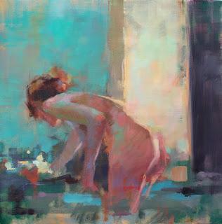
Curve
30 x 30
Colours are at their most beautiful and interactive in the mid tones, the colourist's domain (picture Monet's scintillating haystacks), while tonalists use the drama of a full value range to create their images (think of Rembrandt whose spotlit images are so memorable for everything but their color.)
The pitfall of purely colourist work is that it can appear unanchored and weak, lacking a strong underlying structure (and this is in my eyes, only. All art making and viewing is subjective). So, increasingly, I try to incorporate some strong darks into my work. It gives the paintings focus and solidity in my eyes. The challenge is to gauge the right amount of dark and its placement. Too much, or too near a special color and the darks will take over the work, becoming more important than the color interactions.
I haven't come up with anything as prescriptive as a percentage of dark to use (and would be appalled if it were that predictable), but I do know that the darks must be applied confidently and in significant amounts. If darks are dropped into a high chroma work in small, discreet touches, they feel like little black holes peppered over the surface; so they have to be given enough space and they should be as connected as possible.
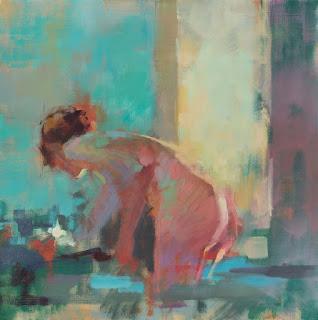
This is "Curve" in an earlier stage of development, before I hit the dark shapes on the right with greater gusto.

You can see that the shape was still a relatively dark area, but was being used to move warm color from the figure into her surroundings, as well as to intensify the yellow/green of the illuminated shape. I could have kept working in this direction - I'd have had to lighten the hair somewhat since it was too dark and isolated for this setting - but it felt weak. So I loaded a 2"brush and went over the right hand shape and some of the lower marks with a rich dark and no hesitation.
Some of you will think that was a bad move and some will wish I'd done much more work in the darks, but that's not important. What matters is that it felt right to my eyes; it had enough conviction and strength for me, and pulled the painting into focus.
The next painting will, however, be a whole new challenge and that's the joy of the process.
Happy painting!

