 It has been a while since we have put together a new template style for Living the Dream, and after nearly 4 1/2 years of blogging we think it is time for another update. As with all of our major site changes we like to put together a navigation style post to let you know about all of the new formatting that we have made. Most changes are pretty obvious and have been implemented over the last few months, but some are subtle that you may not have seen on first glance. So whether you are a new reader or have been with us since the beginning, let us welcome you to Living the Dream v3.0!
New Theme - Where Will Your Dreams Take You?
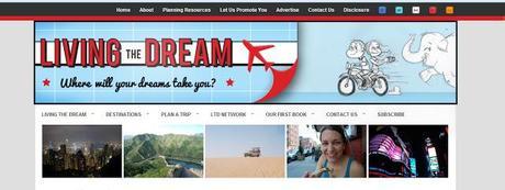
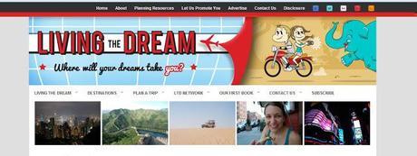
Perhaps the biggest and most obvious change we have made on this site is overhauling our header banner, color scheme, and adopting a new tag line for the site. Thanks to valuable input from the fans of our Facebook page, our awesome designers (Hop and Jaunt) have finally put the finishing touches on our newly commissioned logo that has been updated to correspond with this post.
Our theme going forward for this site is now "Where Will Your Dreams Take You?" as our previous theme of "Going Longer, Cheaper, and Living Your Dream" was adopted onto our first book, The Long-Term Traveler's Guide. With this new theme our goal with the site is not only to share our experiences from around the world, but do what we can to encourage you to get out there and have an amazing trip for yourself. From more detailed planning topics to all things finances we're going to be diving deep into the details necessary for anyone to have a successful trip; be it short-term or long-term. So while we will be sharing how we live our dream, our goal is for you to get out there and live yours.
Evolution of a Logo
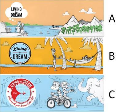
Thanks to our awesome Facebook fans we crafted what we think is the most amazing header logo we've had yet! If you've been following along with our special bonus material on our Facebook or Twitter pages you will have likely seen our logo evolution over the last month. We took the best critiques and relayed them to our designer, Hop and Jaunt, which ultimately crafted the logo we have today. But don't take our word for it! Check out our logo evolution based on the revisions from our designer below. If you're in the market for a new logo for your site, we highly recommend them!
Of course, in addition to our theme change, we have made a number of other minor layout changes that you may have noticed over the last few weeks. The following are a summary of some of our favorites that we hope you'll like!
Featured Post Menu

One of the things about our old formatting that we never quite liked was our Featured Post widget that took up quite a bit of space at the top of the homepage. We tried to make the feature a slider, but could never quite get the code to work out and the load times were horrendous. So for years we settled on a fixed featured post that we swapped out once per week. But that is no more, now we have five featured posts that will be displayed along the header of our site!
These featured posts will be swapped out less frequently, and we hope adds a nice bit of color and options in our header menu. For an extra perk, we recommend you go hover over one of the images now and see what happens!
Social Media Compaction
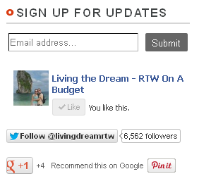
Our sidebar is getting smaller, and one of the major upgrades we performed was compacting our social media accounts into one small box at the top of our page. In this space you can quickly and easily subscribe to our update list via email, 'like' us on Facebook, follow us on Twitter, recommend our page on G+, and pin any of the pictures you see on the page you have open on Pinterest!
If you haven't already, we'd love it if you subscribed to our mailing list and social media features using these buttons. We can assure you what we have coming up will be better than the last 4 1/2 years combined, so we highly recommend you sign up now!
Categories Menu
Our changes to the categories menu on the sidebar is two-fold in an attempt to make getting around our site and finding the best of our 650+ posts an easier task.
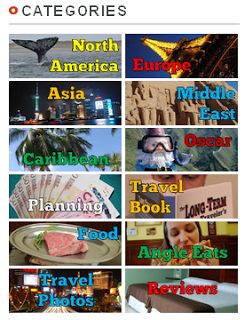
The first change is that our text based categories listing is no more! We thought that our sidebar was already full of enough text and not enough color so we created a new categories listing to display our top post categories with small buttons using our favorite travel photos.
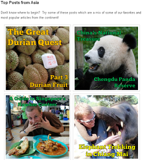
The second change is that nearly all of the major categories listed will go to a landing page for each topic rather than an archive of the posts with that particular tag. Each landing page includes a breakdown of the sub-topics in that category, a selection of some of our most popular posts, and a list of our favorite planning posts when available too! Our collection of posts is now easier to access than ever before thanks to this change. Don't worry, we have links to our archives in each landing page if you like that too!
Footer Simplification

Like our categories feature, our footer has been completely overhauled to give you a number of new options to get around. The two important navigation features we've installed in our footer are Archive and detailed Categories drop down menus. As we mentioned above, with 4 1/2 years of writing and over 650+ posts you can imagine it is difficult for us to keep track of them (hence, the new categories). These two menus should help make getting into the details a bit easier!
The second two navigation features in our footer are links to the other projects we have in The Living the Dream Network. These features point to the additional sites we run including The Travel Atlas, Free Travel Contests, International Food Project, and more. While we want you to stick around and read this site, we encourage you to check out our other projects too!
The Little Details
The rest of the changes we have made on the site are subtle, but necessary. Our posts now have larger text with more appropriate spacing and the body of the post is featured on a clean white background for easier reading. There are quick access buttons on the top header of the site leading to all of our social media profiles including Flickr and Pinterest. Our social media presence has increased quite substantially and we are more active on Facebook and Twitter than we've ever been before, and that is just to name a few of the background changes we have made!
Of course, you may be wondering why we are going into so much trouble overhauling our site. But that reason must be kept for a later date. For now, we want to know what you think about our new changes. Please comment below and let us know what you like and dislike, and if you have any recommendations to make our site better!
