 I know, I know, it's been a long time since I posted...AGAIN! And every time I sneak back on here, with an apologetic air about me and always say that 'things will change from now on and that I will make a concerted effort to post every week'.
Well I'm going to try another tack---because I really do love blogging, but work pressures just get in the way---this time I'm going to say: 'Dash it all, I will post when I damned well feel like it and the world and its cartoony expectations can go hang itself...'
Well lets face it, a genuine desire to produce regular posts have gotten me nowhere, so lets see if reverse psychology works.
Anyway, all that said, lets get onto today's post. Like I said I've been busy with all kinds of projects, namely: my second Sleepy Hamlet novel, plus new strip proposal for syndication; I've been doing special pieces for family and gift paintings for those close to me.
But more about them later...or if I can be bothered to post it here, which I can't even be arsed to think about yet...(see what I did there? Reverse psychology again. I have a good feeling about this---or bad---depending on which angle you take it from.)
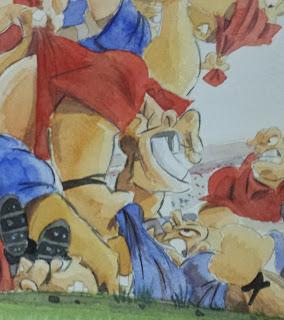
But the topic for todays post is a step-by-step breakdown of a painting I recently completed which will hopefully form part of a larger body of work to be exhibited in a local art gallery to coincide with the Rugby World Cup later this year.
The painting is titled, 'the Friendly' and acts as both a tutorial and a bit of background insight into my practices.
 Stage 1:
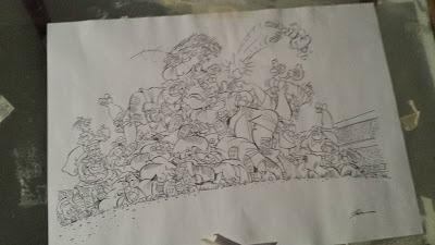
The first thing I do on a picture of this scale is to draw it up, ink it, have it photo copied and reduced and light-box it through.
I do this as a picture that is this involved would be a nightmare to sketch onto the paper and I would lose site of what is what when it came to colouring.
Stage 2:
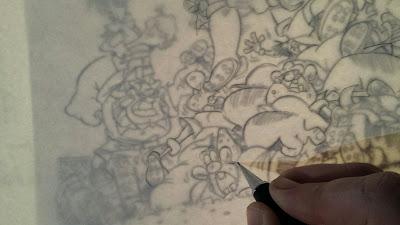
The actual light-boxing of the cartoon. I placed a piece of 325gsm hot pressed watercolour paper, darkened the room and meticulously re-traced all the lines---stopping every now and then to lift the page carefully to make sure I hadn't missed any lines.
Stage 3:
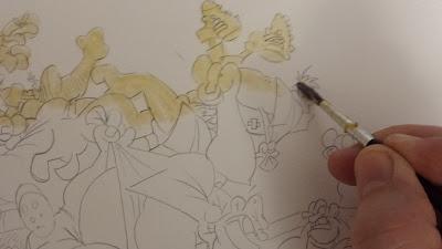
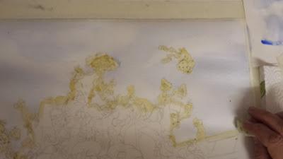
Once again, due to the involved nature of the illustration, I've masked off the upper layers of the characters. I did this as when I come to painting the sky I won't have to worry about cutting in and around the rugby players.
 Stage 4:
I ran a pale wash---wet-in-wet---of cobalt blue. Once that was completed, and still wet, I dipped my artist sponge onto some clear water and began to pull some clouds from the blue. Once again this was done subtly as I didn't want a strong sky to detract from the main body of the painting.
 Stage 5:
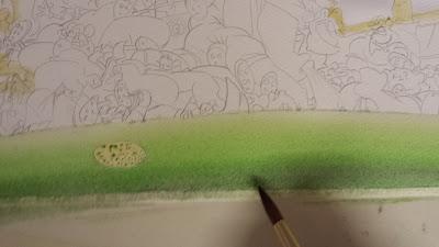
Now comes the initial gradient layers of the grass surface.
At this stage I just wanted to give the impression of fore and background; more detailed work on the pitch would come much later in the painting.
Stage 6:
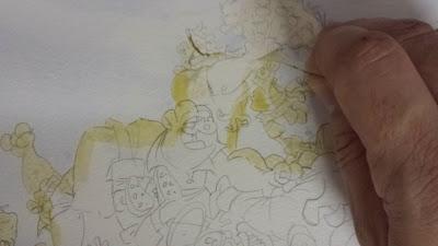
Once the two layers are thoroughly dry I peel off the masking fluid, making sure that there are no bits left anywhere and that the cartoon is clear, clean and ready to proceed.
Stage 7:
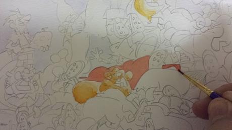
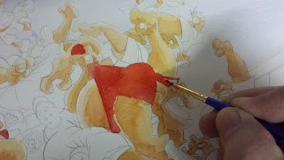
At this point I would normally methodically go through the characters, painting one section at a time, ie; all the flesh, then all the tops, then the shorts, socks, etc. But on this occasion I started doing the initial two to three tones on the flesh and then decided to put in the pale back-wash of red for one of the characters.
I have no idea why I did this but it acted as a stark contrast for me to work the rest of the flesh tones off.
 Stage 9:
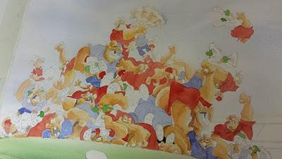
With the flesh tones all done I then continued on with the red tops.
At this stage I had no definite plan of which character would be for what team, so I had to do one, look at the picture, do another and continue the process so as to give the all over painting a balanced quality of color.
 Stage 10:
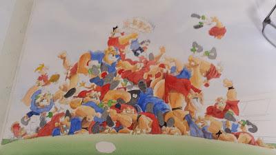
Next came the blue team, and their pale base washes.
Now I am aware that club kits nowadays have all kinds of markings and sponsorship deals on them, but to have that amount of detail in a picture of this level of involvement would've been just too much clutter. So I kept it simple.
 Stage 11:
With the final wash stage being the dark boots and shadows in between the players, I was ready to build the final aspects of the painting in.
At this point I still have no idea if my painting is going to work or go horribly wrong. So I stop and go off for a read and a cup of tea to clear my head.
 Stage 12:
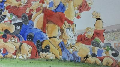
With my tea consumed, and mind cleared I came back to it and over the space of a few hours built up the layers of deeper shadows on the players then the stadium and its crowds behind.
I also worked on the grass; placing onto it pieces of scuffed up turf and dirt from the mayhem thats ensuing all over.
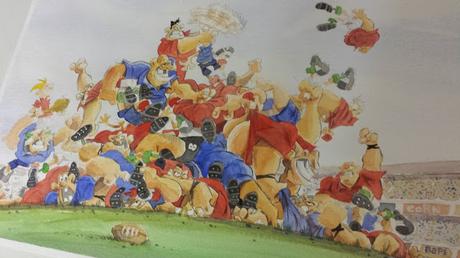
Stage 13:
Finally I could place a subtle outline around the characters. I did this with watered down Van Dyke Brown and a hint of Lamp Black.
And with the masking tape removed, the piece was ready and it was onto the next picture in the series; that one to be titled: the Chase
Hope you enjoyed
