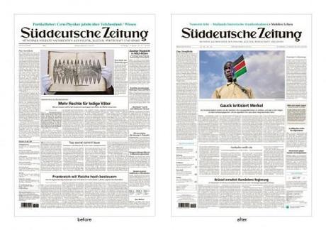
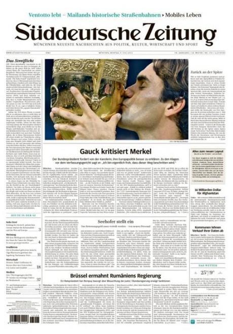
TAKEAWAY: It’s one of Germany’s best read newspapers. Now Suddeutsche Zeitung has finally entered the world of “redesigned” newspapers. It is a minimalist, typographic-influenced design, with a new customized font that carries the name of the newspaper.
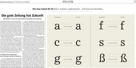
The new font created especially for the Suddeutsche Zeitung
It is not a change that jumps at you in those first 10 seconds. Indeed, one of Germany’s best read dailies, the Munich-based Suddeutsche Zeitung, has a new look, but don’t expect bells and whistles or a change of tune. When the editor says that “nobody will be shocked”, he is quite correct. Obviously, I have only seen the front page, and not the entire newspaper.
The big change is typographic. And, if, as we know, a newspaper’s visual content is 75% typographic, then this is a redesign of major proportions. It would take a German newspaper to concentrate on the typography as the major change in the look of the title.
The SZ has said goodbye to its familiar mix of Helvetica, Times, and Excelsior, which it had embraced since 1965.
It has now welcomed its own font, SZ-Text, SZ-Sans. Created by the ErlerSkibbeTönsmann studio, in Hamburg, the new “Sueddeutsche Zeitung”, also includes an exclusive corporate font.
The Suddeutsche Zeitung is one of Germany’s national newspapers and one that did not follow the trend for a complete redesign during the go-go design years of the 1990s.
In fact, at gatherings of journalists and designers in Germany, the conversation usually turned to the look of the Suddeutsche and how it remained visually static, while everyone acknowledged its good quality journalism and excellent national coverage.
It is 2012 and, finally, the Suddeutsche takes some steps in the direction of graphic changes, a good move. The fact that the redesign is primarily typographic is not surprising, not for a German newspaper and specifically for the visually conservative Suddeutsche Zeitung.
Take a look at a history of the SZ front page
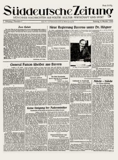
The front page of 1945
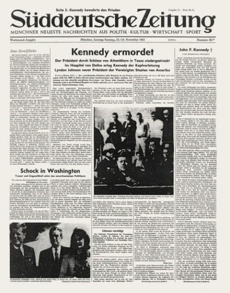
The front page of 1963
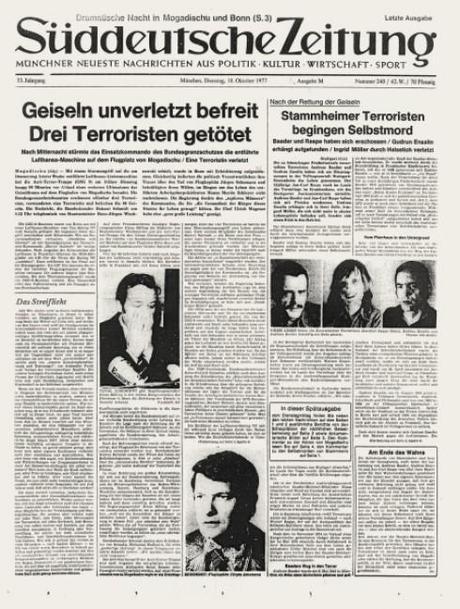
The front page of 1977
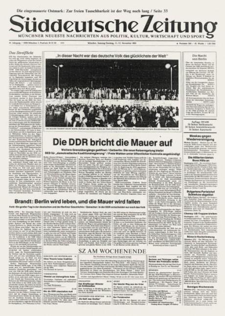
The front page of 1989
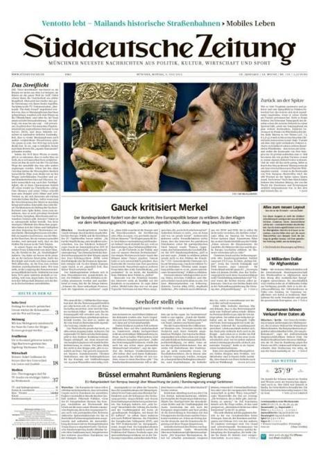
The front page of 2012
Of special interest today
- Australia: SMH and The Age tablet apps launch on Android
http://panpa.org.au/2012/07/09/smh-and-the-age-tablet-apps-launch-on-android/
- Young tablet owners more willing to pay for news
http://paidcontent.org/2012/07/09/young-tablet-owners-more-willing-to-pay-for-news/

