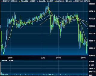
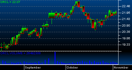
- Price Graph:
 Price graphs are placed in the middle of the stock chart. Its graph may consist of a set of uneven, serrated lines or adjacent bars (candlesticks). If the price graph line is pointing towards the upper right corner of the chart, it shows that stock prices are on an upward trend. When price graph lines are arrowed towards the lower right corner of the graph, this shows a downward trend.
- Resistance Level:
- Price Support:
- Candlesticks :
 Candlestick stock charts make use of bars and provide further information. The length of the bar is the determinant of the opening and closing prices. White bars show a profit and coloured bars show losses.
When the stock is going up, the top of the bar shows the closing price, while the bottom of the bar shows the opening price. There are short lines extending below and above the bar that show the high and low prices for the day.
- Volume:

