TAKEAWAY: This audience was hungry for more than just information on how to improve their newspaper!
Oooooooops……did I really say that?

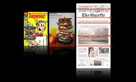
This is a typical “sandwich style” design, with one horizontal strip stacked on top of another, as seen here.
It was a funny moment, after all, thank God for that.
Here I was Thursday, doing a first presentation/critique for the editorial team of Malaysia’s Berita Harian, a page by page evaluation of what works and does not work in their existing newspaper, as we prepare to kick off a rethinking project for this, one of the five Malay language dailies in the country.
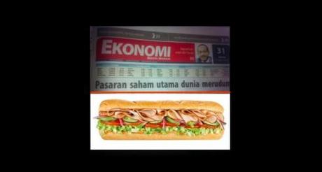
The Economy section opener sported what I call a “sandwich design” style——many horizontal stripes one stacked on the other.
Without thinking much I said: “You might as well put a foot long Subway sandwich here, with all the horizontals, try a layer of turkey, a layer of Swiss cheese, add a layer of ham, then mayo, mustard, pickles and ketchup to make it better….“
One of the persons in attendance cut my sentence short with a smile:
“Oh, please don’t do that to us at 4 o’clock in the afternoon. It is Ramadan here and we are all fasting. A Subway foot long sandwich sounds quite appetizing right now!“
The room erupted in laughter. I apologized profusely: how could I not remember that Malaysia is a predominantly Muslim country and this is the month of Ramadan, the Islamic month of fasting, in which participating Muslims refrain from eating, drinking and sexual intimacy with their partners during daylight hours. This means that for many in the room, their last meal was around 5 am, and the next one not till the evening.
They were all good sports about the sandwich metaphor and I left wondering if it had been better to use my other analogy for this type of horizontal orientation for elements on a page: stacked like pancakes?.
Not really.
How about like shoe boxes at the shoe store? That sounds better, one of the managers told me.
We learn as we go.
A historical note

This front page from Canada’s The Gazette (Montreal) qualifies for the Dagwood sandwich make up of the day!
By the way, in case you have not heard the term “sandwich design”, it truly is more like “sandwich make up” if we wish to be true to the origin of the term, at least in my recollection. In the late 60s, when I was taking my newspaper editing courses from the memorable Dr. Arthur M. Sanderson at the University of South Florida, and long before the term “design” creeped into the newsrooms of the world, the function of assembling elements on a page was referred to as “newspaper make up”, and so when too many horizontals ended up on top of each other, Dr. Sanderson would write “avoid sandwich make up” in big red letters on the size of your page dummy.
No, we did not have Subways in the late 1960s, but the reference point for “sandwich make up” was more like those gigantic sandwiches made popular Dagwood, the popular character from the comic strip, Blondie.

