This blog will be updated thorughout the day Monday
TAKEAWAY: Today, Hong Kong’s best known English language daily appears with new look, new content, daily tab supplements and changes across the platforms. It culminates an 8-month project in which we examined every column, every page.
Hong Kong’s premiere English language daily introduces changes
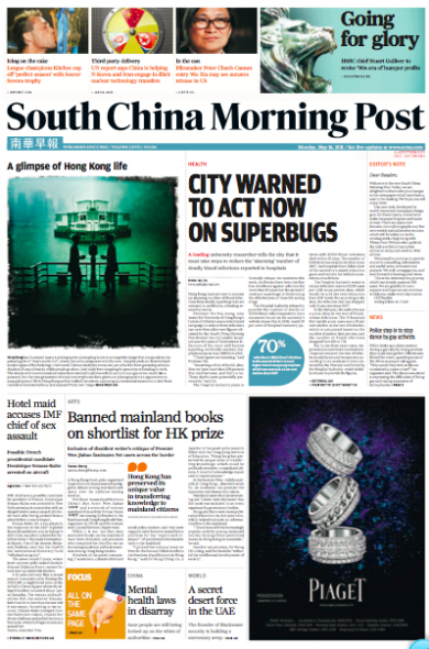
Here is today’s front page (first edition)—will update as more editions appear
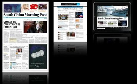
South China Morning Post introduces changes across all three platforms today
Midnight and the press is running in Hong Kong, printing the first edition of the SCMP
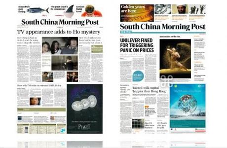
Before and after front pages (in the prototype stages of the project)
My first impressions of Hong Kong’s South China Morning Post are from 2000 when I arrived in the city of skyscrapers that sit on hills like bleachers in a football stadium to redesign The Wall Street Journal Asia.
Here we were converting the big WSJ broadsheet to compact size, but everyday, folded and wrapped in a small cotton bag, would be the South China Morning Post hanging from the door knob of my hotel room.
It was big, contemporary looking and a bit schizophrenic in terms of headline sizes, the stories it displayed on Page One—-one day heavily into the local political scene, the next a sort of cinema noir story about murder in one of those narrow alleys one finds behind the 78-floor towers. So each morning I would look at the SCMP, and, although I liked the energy and modern feel its typography and design evoked, I always wondered silently what I would have done with it if given an opportunity.
That opportunity came in mid 2010 when I had a call from then editor Reg
Chua, who, coincidentally was the editor of the Asian Wall Street Journal when we converted it to a compact format. It was a surprise t hear that Reg was now editor of the SCMP, but also to hear that my friend Steven Tan, with whom I had worked in a redesign of The Star, in Kuala Lumpur, Malaysia, had also joined the SCMP as manager. We agreed to meet and it was like going home to sit with Reg and Steven and map out the rethinking of the South
China Morning Post that premieres today.
(Note: Reg accompanied us in the first stages of the project but resigned in April. He was replaced by acting editor Cliff Buddle, a veteran of the SCMP, whose enthusiasm, talent and professionalism allowed for a seamless transition and eventual culmination of the project).
In the beginning
The Hong Kong of 2011 is not the same I discovered I’m 2000.
Following the much celebrated transfer of sovereignty over Hong Kong from the United Kingdom to the People’s Republic of China in July 1997, Hong Kong has continued to grow upwards into the sky, but continues to provide some od the world’s best shopping, especially of the luxury kind. It is a young place, and one seas a sea of very young faces at every street corner while waiting for the traffic light to change; those double decker buses with the gigantic Gucci or Prada billboard ads on the side often resemble school buses, young faces peering from the windows.
This is the challenge for the South China Morning Post: to attract these young people and to convert them into habitual readers. Although these young people are bilingual , it is chic to speak Cantonese or Mandarin more so than English. The new SCMP would like to show them that it does not have to be, and that reading the English daily will allow them better opportunities both at home and abroad.
But a newspaper’s marketing campaign echo this, but the real proof is in how the editors develop consistent content strategies that prove the point daily.
New content, new navigation
From the very beginning, I was aware that this project would not be a mere cosmetic exercise, or another redesign (of which the SCMP had plenty in its 108-year history).
Instead, the task—-and the challenge—- would be to rethink the 108-year-old English language of Hong Kong for a new generation,a new Hong Kong and, of course, the new powerful and vibrant China.
And, as with newspapers everywhere we had to address the issue of how a printed newspaper thrives and survives in a multi platform world.
The mini newspaper concept
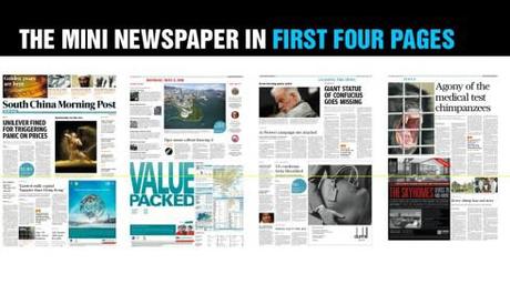
The first four pages constitute a mini newspaper: if the reader goes through these, he/she gets a good idea of what is going on
In a world with tons of information transmitting 24/7, and with impatient readers/users, the newspaper has to offer the type of content flow that adjusts to the lifestyle of those who consume it.
We created the mini newspaper concept to serve that purpose.
The mini newspaper is actually the first four pages of the new South China Morning Post: The front page with the news that you must know plus a window to the best of the inside,the second page a briefing agenda to Hong Kong and China today,with the photo of the day and quotes of relevance; page 3 a second front page packed with more news you should know before getting out to work; page four, focusing on one big theme of the day.
If all that a reader in a hurry reads is those four pages, he has a thorough idea of his world today.
Starting with page 5, the rest of the sectionalized content appears, starting with China news.
Daily tab supplements
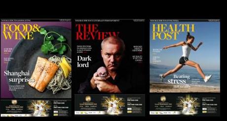
Three of the five new supplements, all tabloids, appearing daily
There will be new lifestyle topics covered through daily supplements in tabloid format,from Health to Food to Money, these subjects which redefine the concept of news and extend it to embrace that which is important in the readers’ lives.
The logo
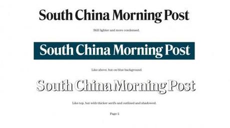
there was never a discussion of changing the logo of the South China Morning Post, but we wanted to clean it a bit, give it more style, and I wanted to. Trey the impact it would have with a blue background color, reversing the letters in white.
As we often do, we commissioned Jim Parkinson to take a look at the logo and offer us hips ideas, which he did in his usual masterful way (see below). The reversed blue logo appealed to many in the management team, so it was decided that we would use it for the Sunday edition.
The typography

The type scheme selected for the new SCMP combines
Farnham and Amplitude for headlines; Utopia for text; and Freight for headers.
The colors
img src=“http://garciamedia.com/images/blog/color_coded_scmpjpeg_thumb.jpg” style=“border:0;“ alt=“blog post image” width=“490” height=“274” />
Part of the process to ease navigation is the color coding of sections.
We created the color palette you see here, assigning specific colors to the various sections and subsections of the newspaper, inspired by the backdrop of colors that is this magnificently scenic city of Hong Kong and its surroundings.
The Post
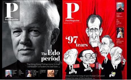
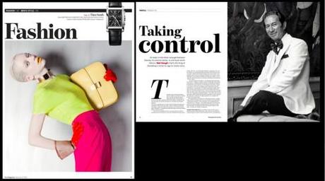
On Sundays, the SCMP publishes Post Magazine, a semi glossy publicación with a variety of content such as features, fashion, food and wine, design, lifestyle and interviews.
Here we created a different logo emphasizing the letter P for Post, and allowing for a systematic index navigator on the cover.
The team
We counted with the assistance of a wonderfully creative team to achieve the good results shown in the South China Morning Post that premieres today: our Garcia Media art director, Jan Kny; the SCMP’s art director,Troy Durkley; the SCMP’s digital editor, Ben Abbotts. For the Post Magazine’s redesign our Garcia Media art director was Nai Lee Lum, working closely with the Post’s art directors,Steve Ellul, and Catherine Tai. Other SCMP designers involved: Stephen Case, art director (Graphics & Illustration), Editorial; Simon Scarr, graphics director; Carl Jones, team head, Design and Layout; Ung Mah Pheng, Editorial Production Manager; Matthew Masiruw, Design trainee

