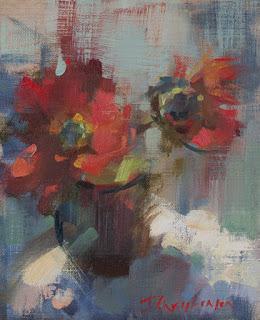
Red Flowers
10 x 8

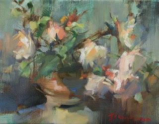
Tea Roses
11 x 14
I find it helps to work a series of these small pieces as I learn something from each one that I can explore more thoroughly in the next one. In the long run, everything will help me to do a better job of the big paintings. And while I don't do color studies for large works (I find that kills the spontaneity of my approach and keeps me tethered to choices made on the test piece) I do use these stand alone paintings to test color choices.
Both of these florals were set up to explore difficult colours more thoroughly: red and white. I find each of these challenging in their own way. Red in strong light has to be lighter, but, if you add white, it turns pink. Lightening with yellow makes it orange. In either case, the essential "redness" is lost. So in "Red Flowers" I focused on both warm and cool red pigments, using cad red light in the lights and alizarin in the shadows, as well as using complements in the shadows. Adding some green into the dark side of the flowers meant that it enhanced the sensation of redness in the lights. Our eyes create complementary interactions naturally, pushing colours into opposition with their neighbours as we look at them. So, while I used both some white and some yellow to create the light side of the flower, the generous use of surrounding green helped keep the flower red.
"Tea Roses" was an exploration of white. It's tricky, too, because the shadows can contain a myriad of colours, but they have to stay high key in order to make sense on such a light value object. The light areas also have to have good color to avoid the chilly, dead effect of using tube white. But, as soon as color is added to tube white, it darkens the mixture. This little floral was much slower and more challenging than it looks, involving lots of scraping and repainting, as I juggled the lights and shadows of the flowers, trying to nail that moment when the shadows felt airy and luminous, and the lights were colourful and interesting. I'll use these hard won lessons in future whites.
There are more florals in the works in my studio. I must be thinking of spring!
Happy painting!

