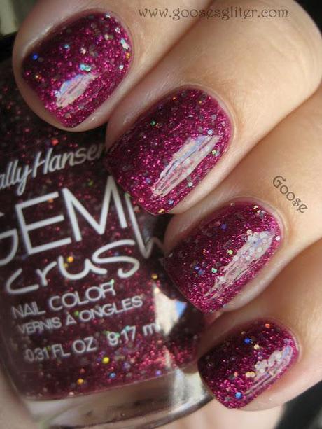
Sally Hansen - Lady Luck
I put this on the other night after having done my nails twice during the day (after swatching in the morning), and it was one of those days where everything just goes wrong. My first polish that day got tipwear and dents from my crazy dog and the second had bubbles galore, so finally I resorted to my "go to" favorite: glitter! So it saved my night as far as nails go.
Now is probably a good time to address my stance on the "photo editing" subject as well. I DO edit my photos:
First of all, I adjust saturation and white balance because let's face it, I'm not the best photographer and I don't have expensive/extensive equipment. I use a regular Canon SD1000 that I got for my birthday years ago and it works pretty well, but not perfectly. I also use natural light, so it's always changing and my camera's white balance can't always keep up.
Secondly, I retouch photos to get rid of lint, hang nails, random polish or glitter bits and other unsightly little things. But this is usually pretty minor and for the most part, my nails look just about exactly like the photos show. I won't take out important things like bubbles if the polish has a bad formula, but I'll take out dents and such if it was my own doing and not due to a problem with the polish.
Thirdly, I recently tried using Photoshop and have been able to better "color correct" pictures to how the polish appears in person. The reasoning is this: I'm interested in portraying what the ACTUAL polish looks like, NOT how it photographs. I will only color correct to make it as close as humanly possible to what it really looks like in real life. I will NOT enhance a photograph to make the polish look lighter/darker/more vibrant (or in any other way "better" or "worse") than it does on my fingers. For instance, my camera will not pick up purples well at all. However, I will edit the photo to bring the purple to a more authentic shade and hue that better represents the polish itself.
Overall, my position is this: I am never trying to make a polish look "better" in any way. I only edit as much as necessary to show it as accurately and truly as I possibly can.
How do you feel about photo editing? It is inappropriate or necessary?
