 Dear friends,
I keep receiving your mini sketch books via email for an evaluation and I am very happy about the trust you have in me and my judgments.
Lately I received some that had the same mistakes and I had to write back telling about: quality, composition on page, rendering quality, visual comunication and presentation's objectives.
I would like to remember to you that if you want to hope to get a job or internship interview by sending your mini book you have to be very careful to several aspects to make sure you gain the right quality standard, you have to position yourself in the right professional range to get your interview. You are also in competitions with many other students writing and sending portfolios just like you!
So here for you a short list I made of what not to forget and what to check before sending your mini portfolio book:
-First: to which company are you sending it? Did you check in internet or special car design magazines the latest infos about that company? What do you really know about that company?
This aspect is important because you will see and understand at once company's design philosophy, style, design codes, about its big design boss and his recent past, most successful projects and production cars. In a few words you will go to that interview with a clear overview of what that company is, this will give you more confidence to stand an interview.
Remember tha information is power!
-Second: look at your mini book and see if it could match that company's expectations, I do not mean you have to be sure of the right solutions to offer because it is impossible...however; you have to understand if your projects and their arrangements fit company's profile.
Remember do not show tractors and industrial design projects to a sports car design studio! Got the point?
-Third: lets check about portfolio rithm (is it boring or exciting?), about sketch quality (proportions, technique, perspectives, composition, energy. Did you put also well done free hand sketches?
-Fourth: check your final rendering pages, do you have a nice composition on page without overworked colored renderings? Did you think to have a focal point on your illustrations? do you have nice light backgrounds? Is your work punchy with nice cool contrasts? Do you have good proportion color works compared to your page size? Is your red or blue car sketch really looking red or blue?
-Fifth: what the hell are you going to tell them once you are there opening your book? Did you prepare a simple story to tell about your projects without forgetting your : introduction - story - conclusion? Did you check how much time you need to tell all this?
Remember that concise and clear is much better than long and confusing speech....no bla bla bla!
-Sixth: last point is about your CV at the beginning of your mini portfolio book, read it many times to make sure that dates are corrects, content is real and in the right order, your graphic editorial design reflects yourself with no over designed CV.
Remember that a CV must be read quickly with the right info easy to find and...do not put your photo on it!
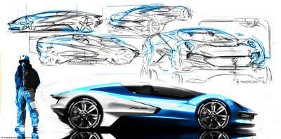
This image is a very nice sketch-rendering sample made by designer Akos Szaz check his sketches for inspiration clicking: Akos' portfolio.
If you liked this post please spread the word around or copy it on your blogs with a back link :)

