TAKEAWAY: We take a look at some fantastically informative infographics published in the South China Morning Post AND: Do you know some news apps that deserve to be shown in my book, Storytelling in the Times of the iPad?

Reviewing three months of South China Morning Posts during this visit
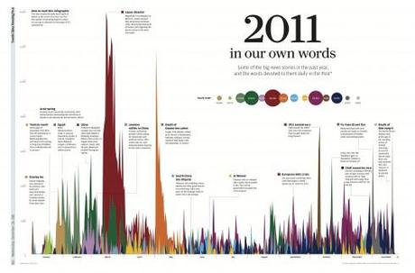
This is one of the most interesting and original infographics I have seen: graphics director Simon Scarr’s graphic explains how many words the South China Morning Post devoted to a variety of topics.It is fascinating to see how some topics hit a high then disappear quickly from the radar, while others linger. The headline: 2011 In Our Own Words: Some of the big stories int he past year and the words devoted to them daily in the Post. It was the Japan disaster, the magnitude 9 earthquake that hit March 11, that took the honors as the most written about story. If you follow the color coding, you can see how much longer that story stayed in the news; the death of Osama Bin Laden took second place; third place, the 100th year anniversary of the revolution that brought down the Qing Dynasty in China.Anyone who produces a daily news report will find this graphic instructive and informative.
See the interactive version of the graphic above :
http://events.scmp.com/news/content/YearEnder/home.html
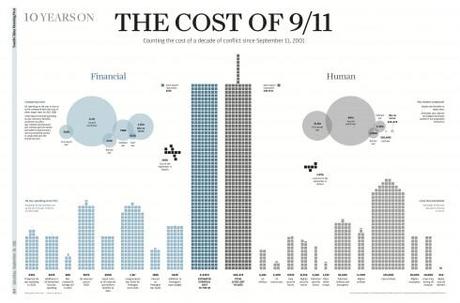
Another Simon Scarr graphic: the financial costs of 9/11
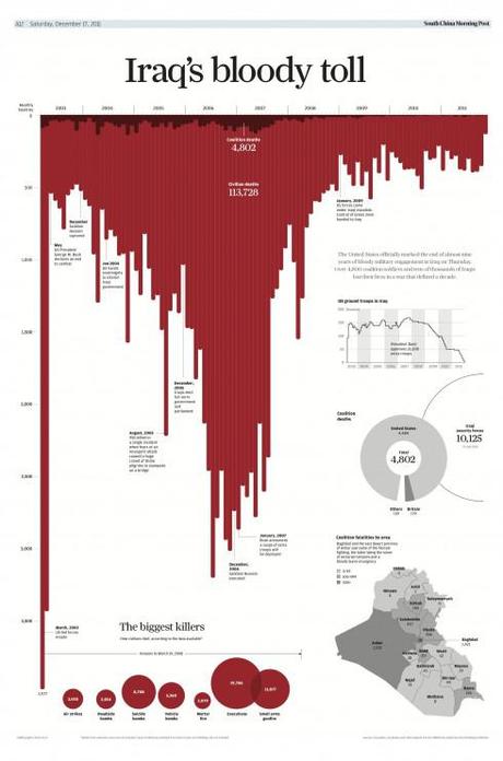
The cost of lives in Iraq; by Simon Scarr; a very dramatic and effective way of presenting the grim statistics
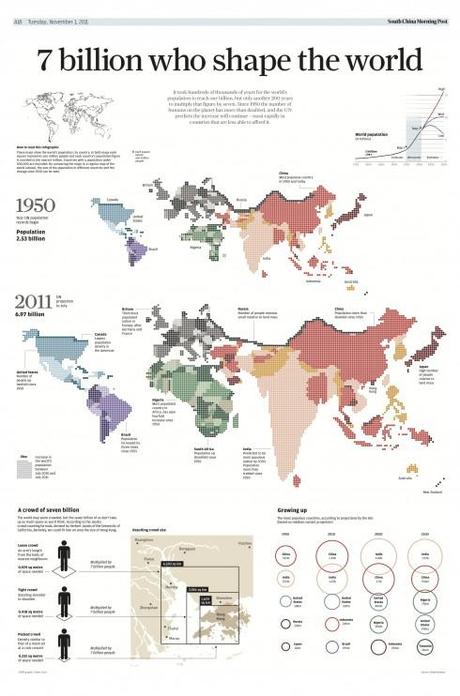
In this graphic, Simon Scarr shows us who we are following the birth of the 7th billion citizen of the world
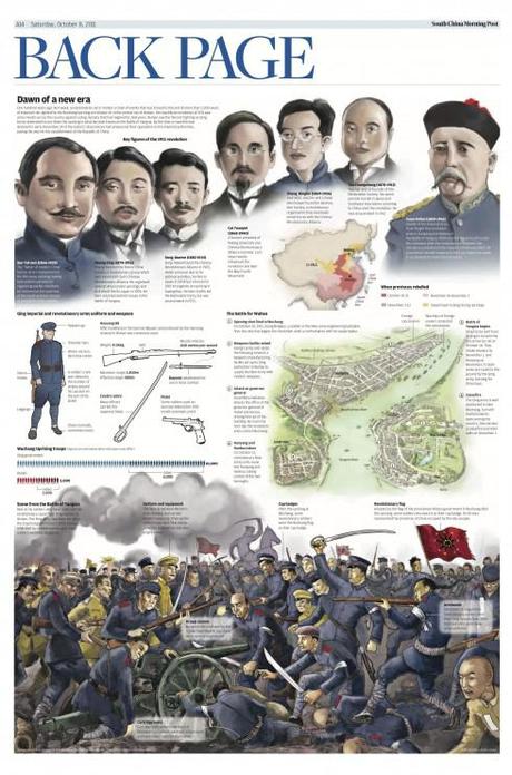
An Adolfo Arranz graphic depicting the main historic events to describe the 1911 China Revolution
This is my first visit of 2012 to the South China Morning Post, which as readers of the blog know,
%0A">
%0A">
%0A">
%0A" title="premiered a new look">premiered a new look and content organization May 16, 2011. And, although that was the launch date, the process of evolving and improving is a continuous one. I come back every three months to monitor progress and to conduct meetings and workshops with the various editors and managers.
I continue to be surprised with the progress made by the SCMP team. The newspaper continues to make good progress and has even increased the circulation moderately since the launch.
However, now there are two important challenges ahead, which occupy a lot of my time here:
1. The launch of a newly redesigned website for http://www.scmp.com, done in cooperation with Mario Garcia Jr., working closely with digital director Etienne Maccario, and digital art director, Ben Abbotts.
The new website will premiere May 16, but the final prototype is now ready for final tweaking.
2. The printed edition of the South China Morning Post will adopt a narrower (27”) format in August. Working with Cliff Buddle, acting editor in chief, and Carl Jones, design director, we are taking a look at the creation of new templates and how the existing typography and design must adapt to the new page measurements.
I will report about these two developments when the time comes closer for their launch.
Infographics take center stage at the SCMP
Today, however, I turn my attention to one area of the new South China Morning Post where there has been great progress, and talented hires: infographics.
I have been nothing short of mesmerized by the examples of storytelling via infographics that I have seen when reviewing the past three months of South China Morning Post editions.
The examples shown here illustrate the point well.
New graphics director at the South China Morning Post is Simon Scarr, whose work we showcase here today. Simon came to the SCMP from Singapore where he was a graphic journalist at Reuters
In addition, we show an example of a full page infographic by Adolfo Arranz, SCMP staff artist.
Together, their work, presented in full pages and sometimes double pages, shows what is possible with good planning and talented artists.
Creating the 2011 graphic
I was so impressed with that 2011 content coverage (above) that I asked Simon to give us a briefing about the conceptualizing and planning for it. Here is what he had to say:
“We had been creating a number of large feature infographics for the back page over 2011 and decided we should finish the year off with a wrap up of the biggest stories. Most of these advanced graphics are conceptualised in our graphics department, usually by myself and also the Art Director/Section Head (Stephen Case). When creating a stand alone graphic, I look for interesting ways to present the data or story I’m trying to tell (such as the 9/11, Iraq, Population graphics) while also keeping it clear to the reader.
“In this case, we knew a timeline with text and pictures would not be enough to excite and engage the reader. We wanted something that could not only chronicle the year’s news, but also highlight the magnitude of the stories. After brainstorming and testing a few concepts we decided to chart the daily word count of each story, showing the reader how the stories developed over time. Some with large word counts but disappearing quickly. Others would build up slowly and stretch across the whole year. Using our own words from the SCMP would also give a local angle to such a broad range of stories.
“I created a rough draft and pitched it to the Editor who gave the go-ahead. We then asked different editorial departments for suggestions of their most important stories. Our researcher continued to compile more detailed spreadsheets of the word counts and I got to work putting it all together making sure it was clear and worked well, discussing with the Art Director along the way. We also worked on an interactive flash version of the graphic for the website.
See the interactive version of the graphic here:
http://events.scmp.com/news/content/YearEnder/home.html
Previous blog posts about South China Morning Post
South China Morning Post: new beginnings in a new Hong Kong, new China
http://garciamedia.com/blog/articles/south_china_morning_post_new_beginnings_in_a_new_hong_kong_new_china
On the fourth day: South China Morning Post design evolves
http://garciamedia.com/blog/articles/on_the_fourth_day_south_china_morning_post_design_evolves
The marketing of the South China Morning Post relaunch
http://garciamedia.com/blog/articles/the_marketing_of_the_south_china_morning_post_relaunch
South China Morning Post: Three months after its rethinking
http://garciamedia.com/blog/articles/south_china_morning_post_three_months_after_its_rethinking
The iPad Lab case study: The South China Morning Post introduces app version 2.0
http://garciamedia.com/blog/articles/the_ipad_lab_case_study_the_south_china_morning_post_introduces_app_version/
Help me find the best news apps for my book
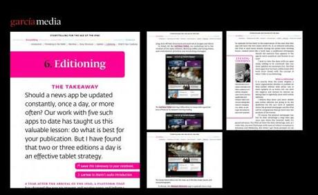
I spend a great deal of my time now writing what will be my first digital book, Storytelling in the Times of the iPad.. It is exciting to be contemplating all the possibilities that a book especially created for the tablet presents. While I am writing each chapter on all that is possible, I am well aware that the book itself must be an example of all that can be done in this new platform.
Right now I am writing a key chapter in the book, Look & Feel, involving those components that provide us with a design: typography, grids, color, creativity.
I am recruiting you to help me find the best examples. Have you seen news apps with grids that are functional and contribute to well organized design for the content? Or news apps with typography that is easy to read but also beautiful to look at? And how about color use and color palettes? If so, drop me a line and tell me about your favorite news app. I will take a look for possible consideration.
There is still time for you to get involved. How about documentary apps, where a good single story narrative is presented with appeal to all the senses?
I thank you in advance for your contributions.
And in the Ooooooooooops front page category

As seen on Page One of the Belfast Telegraph
One of those days when the promotional strip should have been removed.
But we all know how easy it is to make these mistakes.

