TAKEAWAY: Garcia Media is proud to announce the appointment of Reed Reibstein as art director/project manager. The recent Yale University graduate will work with us full time on projects across all platforms. He began with us as a summer intern in 2008 and has been Mario’s copilot ever since.

Reed Reibstein becomes art director/project manager at Garcia Media
It was a fortuitous meeting in 2008, and the young freshman among the group of eagerly enthusiastic students in the upstairs library of the Yale Daily News building was one of the first to introduce himself.
“Hi, I’m Reed,“ he said and smiled.
While many of Reed’s colleagues added their title at the YDN during their introductions, I noticed that Reed did not, and, of course, three years later I understand why.
Reed Reibstein, who graduated from Yale University last month with a degree in art history, is a man of many talents. He was all over the place in the newsroom of the Yale student newspaper even then, as a newly arrived freshman.
He was a little bit production man, answering questions related to InDesign, but then 20 minutes later I would find him engaged in a discussion about photo editing, only to turn his attention later to the overall look of a page on culture. But, my colleague Dr. Pegie Stark Adam, who collaborated with me on the redesign of the Yale Daily News, and I, were totally and most surprised by Reed’s intimate knowledge of the most minute details of typography and type design.
After all, here was a guy who had wanted——and got—- the Leitura Sans type family (http://dstype.com/index.php?id=14) for his last birthday.
A gifted young man
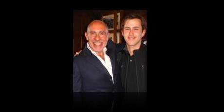
When Mario met Reed: this was an after dinner photo in 2008, the day we met at the Yale University campus
By the time dinner with a selected group of YDN staffers concluded our first evening visiting the beautiful and historic Yale campus, I knew that I was in the presence of a gifted young man.
Throughout the redesign of the YDN, Reed was a key member of the talented team that accompanied Pegie and me. Not only was this affable guy remarkable, smart and personable, but he exhibited at the age of 18 the people skills of a true team player which eludes so many twice his age or older. Reed never once let his talent or knowledge overstep the boundaries of staff hierarchy. Often I would call him when about to make a decision, but he always would offer his opinion while quickly reminding me that I needed to consult with the YDN’s top editors. He expressed opinions firmly, especially about type and design, but without ever using a harsh word about his colleagues.
By the time our project was concluded, I knew that my own and Garcia Media’s association with Reed had to continue. I invited him to be our summer intern, and what a thorough, disciplined and studious intern he was. Everything I did the summer of 2009 was better and more incisive because Reed was my copilot.
And, so, when it came time for Reed to return for his sophomore year. I invited him to stay on board with me, and to share his free time through the school year, which he did. I remember telling him that while he rewarded me with his fresh insights, we would send him a tiny monthly allowance to take a date out to dinner from time to time.
No stipend could pay for Reed’s dedication and how he would make me see our media world from the perspective of someone almost two-thirds younger than me. Our first road trip together as a team took us to the newsroom of The Philadelphia Inquirer, a tour de force for a historically significant newspaper in trouble. Reed presented his ideas with clarity, prepared like a pro and was never intimidated by the role I had assigned him to play.
Last summer I asked Reed to help me with the planning and execution of our tablet conference at The Poynter Institute for Media Studies, which he did, adding substance and the intuition of his generation: those who don’t remember life without Google.
Reed’s stellar performance convinced me that we at Garcia Media would try to lure this talent to join us full time upon graduation.
Meet our new art director/project manager
Today, three summer internships later, we are proud to announce that Reed Reibstein (Yale ‘11) joins us effective immediately as art director/project manager, based in New York City. I admit that just like it was difficult to give him a title at the YDN, we found ourselves struggling to find the words that will describe what he will do. Here is a young man with great passion and respect for the printed page, but also a phenomenal grasp of everything digital.
He will occupy my co-pilot’s seat full time, also working closely with Mario Jr. and Garcia Interactive. He comes into a non existent position, so we will be defining Reed’s role as we go, but he will be involved in all projects and I hope that he will not only contribute the point of view of his generation—-the so-called digital natives—- but also engage in pre-project research, with emphasis on his tremendous expertise in typography.
The fact that Reed will be based in New York City will allow us at Garcia Media to have a firm base in the US”s most important publishing hub, while offering Reed easy access to airports with daily flights worldwide.
Two who know Reed offer their views
Pegie Stark Adam worked with Reed and me during the 2008 redesign of the Yale Daily News:
“When I first met Reed during our first meeting at the Yale Daily News I knew immediately he was a soul mate as we discussed at length the beauty and elegance of different type families that we could explore for the redesign. Not only did he already have a vast knowledge of design, he had an enormous appetite and curiosity for learning as much as he could to help with the redesign. If a certain design school of style was mentioned, he returned the next day with the entire history of the movement researched and analyzed. Reed, Mario and I spent a week together in my Canada studio the summer of ‘08 to complete prototypes for the redesign. I was amazed at Reed’s creativity, organizational skills and tireless effort to coordinate conversations between his peers, Mario and me as we experimented with various approaches. Reed was a partner in the process, introducing ideas and solutions that were innovative and fun. Congratulations, Reed, on graduating and for the good work you have done and will do as Mario’s co-pilot!“
Mario Garcia Jr., Garcia Interactive, who has worked on a variety of projects with Reed throughout his internships with us:
Working with Reed provides the greatest comfort in the world. He’s organized, always prepared, knowledgeable of the details of the project and great with clients. He truly adds to every project he’s a part of and his reliability makes him an asset.
A three minute interview with Reed Reibstein
As he prepares to board the Garcia Media train—-it is more like a jumbo jet—-Reed has answered these questions that best sum up his ideas and aspirations as he embarks into this, his first full-time job after graduation.
Mario: You have graduated with a degree in art history. How do you see your academic background impacting your work at Garcia Media?
Reed:
I became an art history major not to study the fine arts, but the history of graphic design. Although the department didn’t offer any courses specifically about book design or stone lettering, I learned about these and other subjects through independent research with accommodating professors. I hope that my knowledge of design history will inform the projects I work on, providing visual inspiration and helpful parallels to the team. I also plan to use the research skills I acquired by authoring and assisting with blog posts, presentations, and white papers.
Mario: I have enjoyed working with you for three years now, and I often tell people that it is absolutely magnificent to have someone in your age group as my “copilot.“ But I have never asked you how you feel about the role you play in our collaborations, which, of course now will become more frequent. How do you see the dynamics of the Mario-Reed collaborations?
Reed:
I think of our collaborations as tremendous learning experiences. Not only in design—though I’ve improved a great deal through your feedback—but in how to negotiate business dealings and interpersonal relationships. Mostly, however, I’m honored by the responsibilities you’ve given me. Despite my youth, you have allowed me to participate fully in major projects, dealing directly with editors and managers. I take your faith in me seriously, and try to give back to you as much as you have given me.
Mario: One reason our partnership is so effective is because even though we are two very different generations, we complement each other, and I have great admiration for how you respect the role of print and the “print is eternal” idea, which we foster in all our work. You and I often engage in long conversations about the role of storytelling. How do you see yourself, a 22-year-old with no remembrance of life without the Internet, engaging in your new role as art director and project manager?
Reed:
I see my role as a chance to explore the many current platforms for distributing the news. What is inherent about journalism in print and on the web, tablets, and mobile phones? And what is flexible? The tablet is such a new device that I can’t wait to see what can be done with it. Yet I suspect that the printed newspaper still offers plenty of room for innovation. After all, every newspaper begins as a stack of folded papers; everything printed on it is available for reconsideration.
Reed facts at a glance
Born: New York, N.Y.
High school: Riverdale Country School, Bronx, N.Y.
Work in publications: The Riverdale Review, Yale Daily News, Yale Daily News Magazine, Daily Nation (Kenya), The Philadelphia Inquirer, Philadelphia Daily News
College: Yale University, Class of 2011
Senior Essay: “ ‘To the great Variety of Readers’: Hamlet on the Page.“ Winner of the A. Conger Goodyear Fine Arts Award for an outstanding senior essay on any topic in the History of Art.
Additional: Enrolled in Letterform Design with Tobias Frere-Jones at the Yale School of Art.
TheMarioBlog post #785
Rediscovering the evening editions: desperately seeking those” lean back” readers
TAKEAWAY: They disappeared one after the other, those lively evening newspapers that commuters in most major American cities picked up on their way home. But now, in 2011, many voices are clamoring for the return of news in the evening, especially on the tablets. Let readers “lean forward” during the day, but “ lean back” for a good evening read. PLUS: The Russian daily, Izvestia, really really likes The Wall Street Journal front page, it seems AND: Packaging your deodorant with your news, Dubai style
News in the evening
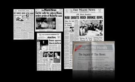
Images of front pages from The Miami News, Miami’s evening newspaper, which ceased publication in 1988. It is in this newspaper that I cut my teeth and learned so much.Big headlines, lots of stories tempting commuters on the way home!
Part of the reading I have done during my 10-day hiatus in the sun, in the beautiful Canary Islands, land of my maternal ancestors, has had to do with a sudden interest, especially among US newspapers, about evening editions, those long ago abandoned reminders of another time, what some call the golden era of newspaper publishing.
As someone who began my career in an evening newspaper, The Miami News, in that Miami of the 1960s, when two newspaper towns were the norm for most American cities, I am happy to see that people are giving the evening news edition some serious consideration again. When the Miami News shut down at the end of 1988, Bob Greene, of The Chicago Tribune, described its demise this way: “if you`re at all interested in this kind of thing, you know some of the reasons that are invariably given for the deaths of evening papers. Competition from late-afternoon and early-evening television news broadcasts; difficulties in delivering evening papers in congested cities; changes in the leisure habits of newspaper readers.“
But, alas, Greene was a visionary, and his column went on to add:
Every instinct tells me that the time is right for the growth of evening newspapers again.
Yes, there are still evening TV news broadcasts. Yes, it is still tough to maneuver a newspaper delivery truck through a crowded city during afternoon rush hour.
But more and more people I talk with tell me that they are reading their newspapers at night. I`m not referring to people in cities where the newspaper is delivered in the late afternoon; I`m referring to people in morning-newspaper cities.
Absolutely, this was true in 1988, and it is even truer today. I have participated in hundreds of focus groups and I can testify that for years now I have heard readers telling us in various parts of the world that they read their daily printed newspaper in MORE than one seating: a little in the morning, some later during a coffee break, and a LOT of it in the evening.
For years, at every opportunity I have had in front of editors and publishers across six continents I have said: there are opportunities for evening newspapers.
The tablet and evening editions for both print and tablets
Ever since the iPad came out, and during my first discussion with the team of Colombia’s El Tiempo about their iPad edition, I have
%0A">
%0A">
%0A">
%0A" title="maintained ">maintained that the tablet lends itself perfectly well to an updated evening edition.
Now, the little research we have on tablet reading habits points to a high rise of readership in the so called evening prime time, from 7 to 11 pm.
But this is a call that printed newspapers need to heed.
If, as we know, the mobile phone and , particularly online editions, have monopolized the time advantage for constant updates, and, if those are the most likely platforms for people to rap into in the morning and during working hours, then it makes sense that the most relaxing and contemplative platforms of the printed and tablet editions capitalize on the down time.
As Audra Martin, VP, Customer Engagement and Operations at The Economist, describes it:
The main thing for us was to provide an immersive experience. The principal audience needs we uncovered were the ‘lean back’ experience on weekends - to keep yourself fully informed, and the ‘lean forward’ one throughout the week - where discussion and debate come to the fore.
The iPad user experience seemed to fit with the immersive/lean back need - so we tailored it around the detailed approach of the weekly edition, added functionality so that you can also read it offline, and listen to the audio edition.
In terms of daily newspaper operations, I can see that the mobile phone and online editions are definitely “lean forward” platforms, used throughout the day, when we are seeking constant updates, while the printed edition and tablet are “lean back” platforms, sort of take off your shoes and read the longer pieces, contemplate, meditate and understand that which you leaned forward earlier in the day to get as fresh news.
To me, this was always the object of evening newspapers.
Meanwhile, in Dubai
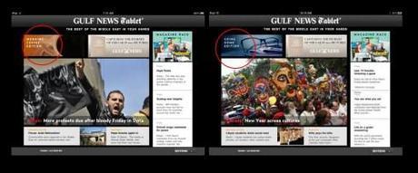
Notice the circles where I highlight the Morning Coffee or Going Home editions for the Gulf News Tablet
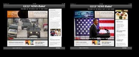
Morning Coffee and Going Home landing pages side by side
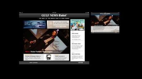
Sometimes the lead piece in the evening edition is all about fashion, why not?
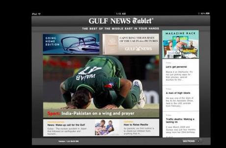
…or it could be the sports story everyone is talking about
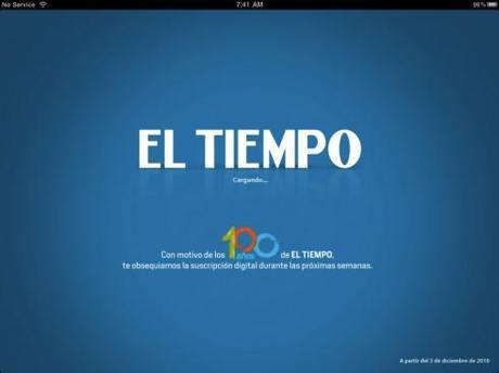
At Colombia’s El Tiempo: two editions a day, morning and evening
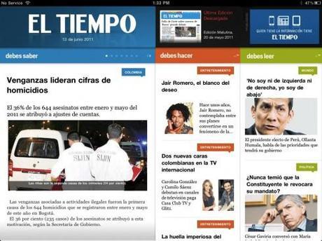
Here is landing page for morning edition of Monday
I happen to be in Dubai this week, where we have collaborated with the Gulf News team in the creation of the Gulf News Tablet, a customized product especially designed for the needs of tablet readers.
The GN Tablet experience is NOT a replication of either the printed edition of the Gulf News nor its online edition.
With a global audience, it is a digital edition that capitalizes on Middle East news and features, with emphasis on UAE and Dubai news, of course. While the 1.0 edition premiered in April, we now prepare to tweak and to launch the 1.5 edition, which will include news feed components.
But one thing is the key to its success: the editioning concept. The Tablet calls its editions Morning Coffee and Going Home. Each has a special way of handling the content—-newsier in the morning, more feature/magazine, longer pieces in the evening.
This is what we are doing here, and it is what apparently the industry is beginning to turn its attention to.
In California: The Orange County Register
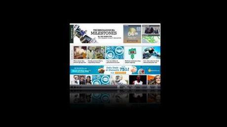
The Orange County Register has entered the tablet field with an especially “curated” edition published late in the day, to cater to the preference of tablet readers who use the platform more extensively in the evening hours.
A good idea, and one that we have followed in both Colombia’s El Tiempo and the UAE’s Gulf News.
It is early to tell if this is the only way to go, of course, but the early signs are encouraging.
And, not just for tablets. I can see that many printed newspapers may consider evening editions again, and, indeed, abandoning their morning editions all together.
It is “lean back” time for the printed newspaper if it wants to move forward.
Of related interest:
Time to bring back a P.M. news product
http://newsosaur.blogspot.com/2011/06/time-to-bring-back-pm-news-product.html
Russian style flattery
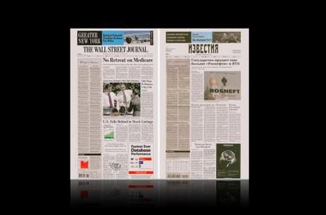
Front pages of The Wall Street Journal and Izvestia: any resemblance is a pure case of admiration
I can’t help but think of actress Sally Field’s reaction when getting her Oscar: for Places in the Heart (1984). In her acceptance speech, Field said : You liked me, you really, really liked me!
Change it to You Like Us, You really,really, liked Us, and I imagine that this is what those folks at the Wall Street Journal and Newscorp are saying after seeing the new front page of the Russian daily Izvestia which holds a, should we say, a close resemblance to that of the venerable American newspaper and chronicler of the financial world.
My Russian contacts tell me that, indeed, there is a resemblance, but that Izvestia people allegedly consulted with the WSJ, perhaps to express their total admiration.
Maybe with a message wrapped around the front page that read: From Russia with love.
Start spraying the news
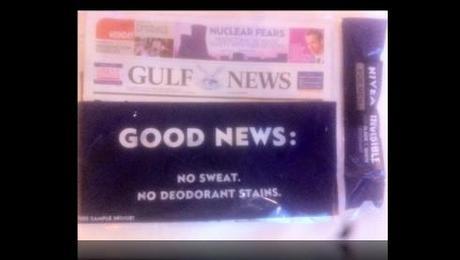
This week: Nivea’s sample of men’s deodorant in plastic wrapper around the entire newspaper
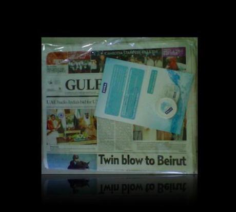
Earlier this year, Nivea cream for the ladies, also in wrapper around the entire edition of the newspaper
Surprise, that is a can of Nivea deodorant for men you find wrapped around your morning Gulf News of Dubai. Yes, sir, it is a plastic baggie, with the Gulf News edition inside, and a sample can of deodorant to one side. Spray yourself clean before you head out the door. And, yes, there was one day with Nivea’s deodorant for women, too. From what I am told here: those editions of the Gulf News sold out quickly. Indeed,in a city where the temperatures rose to over 44C today Monday, deodorant is quite a necessity——and, of course, so is all the news.
TheMarioBlog post #784
In the Netherlands: historic AD launches new look, content organization
TAKEAWAY: The Netherlands’ second largest circulation daily, AD, based in Rotterdam, goes for a three tempo content organization, new fonts, color palette and a look that enhances its popular newspaper look, while allowing for some elements of the classic as well.
The powerful look of Dutch newspapers
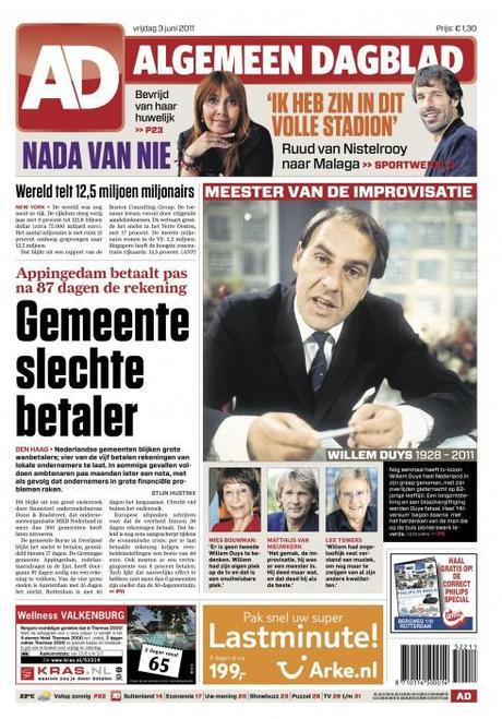
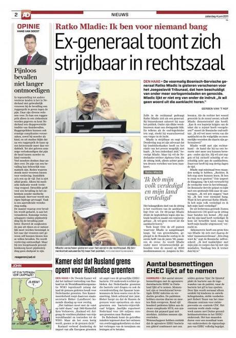
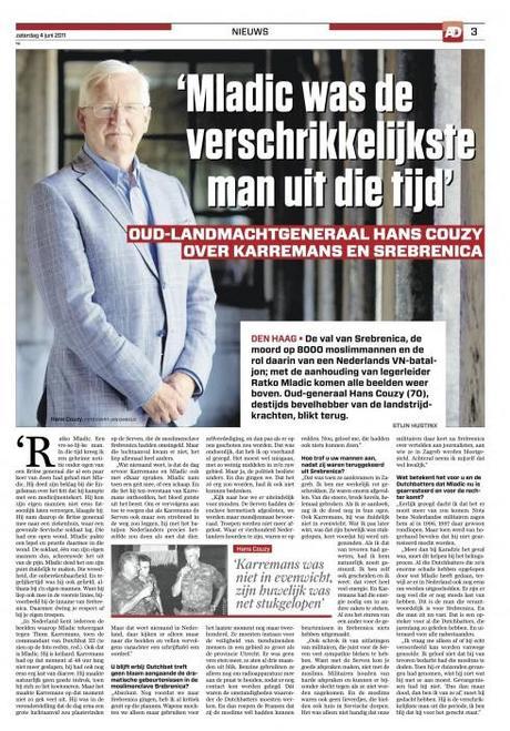
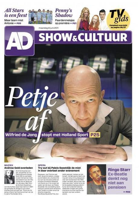
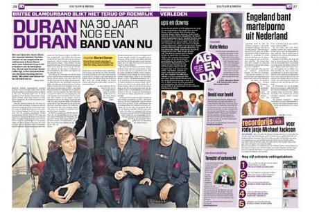
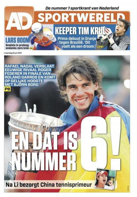
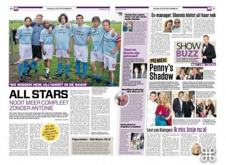
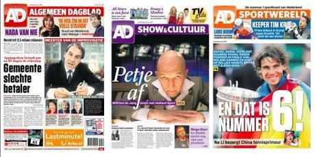
The three tempo newspaper: News, Show & Culture, Sports
When Christian Van Thillo, CEO of Belgium’s Pers Groepe, called me in the fall of 2010 his phone briefing was direct and to the point: Mario, our group now has purchased the Netherland’s AD newspaper, and, although it is successful as it is, I feel that it needs some retooling, nothing too major as readers like it the way it is, but we feel that it could be spruced up a bit, without taking away its personality. By the way, when it comes to Dutch newspapers, “personality” is best when bold, robust, with bigger is better for headlines and photos.
And so, when Christian Fortanet, art director for Garcia Media, and I, landed in Rotterdam, the second-largest city in the Netherlands and the largest port in Europe, we came prepared for a redesign light. Two hours into that first workshop with the management team, including Van Thillo, we knew that this would be a total rethinking for the 65-year-old daily that was born a year after World War II.
You see, AD is a popular newspaper, one of those with lots of personality: big headlines, the many colors together on the same page, the stories on page one that we associate with the downmarket tabs. But it also carries content that would place it in the category of the regular family daily newspaper, not necessarily one catering to the traditional downmarket audience.
The AD’s main competitor is that over the top broadsheet called De Telegraaf-—a daily assortment of giant headlines, the most non modular page structures next to Germany’s Bild, and an assortment of photo silhouettes, underlined headlines and the 76 trombones. While the AD counts with 1.5 million daily readers, the Telegraaf has two million. So, it is a sort of neck to neck competition between the two dailies.
Our task
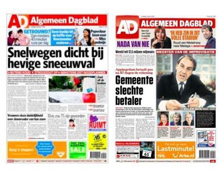
Front page before and after the change that premiered June 3
The redesign/rethinking of the AD provided us with an opportunity to tweak the existing logo a bit. Our art director Christian Fortanet was in charge of this part of the process. The new logo is a “soft” change that creates a more rectangular look, and provides us with a branding element that is user to use across multi platforms.
So how could we take the AD to the next level, in the face of this competition. I must mention that AD is very locally driven, with 19 daily regional editions for various cities across the Netherlands. For each, the name of the newspaper changes according to city, as in AD Algemeen Dagblad, AD Rotterdams Dagblad, AD Haagsche Courant, AD Utrechts Nieuwsblad, AD Groene Hart, AD Amersfoortse Courant, AD Dordtenaar..
“It is local content that separates us, nobody covers the nitty gritty of each location the way the AD does,” said Christiaan Ruesink, editor in chief. “Whatever we do to the AD, we must retain this level of localness which is the reason so many of our readers come to us each morning.”
In addition, I soon realized that the AD spread its wonderful content all over the place and was not easy to navigate. Many of the good stories could possibly get lost.
That is why we studied the content flow of the AD and came up with the idea of the three tempos, three sort of mini newspapers inside the one daily: News, Show & Culture, Sports.
This organization facilitated content distribution, allowed for better Page One navigation, and, in terms of design, gave us clear directives for how to approach everything from type to color and story structures.
The logo

Logo before and after
The typography
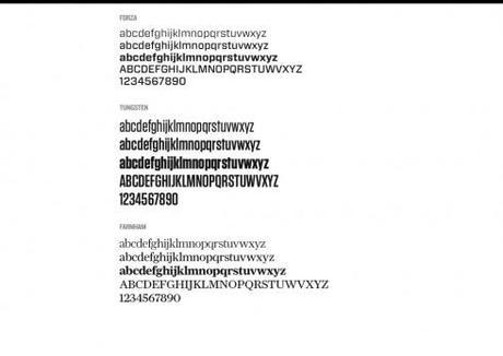
The typographic scheme of the AD consists of four fonts: Forza, Tungsten, Farnham and Flama.
In the original prototype, we had made greater use of Forza, but the editors felt it could not fulfill all of their needs, special for feature material, so we substituted the Forza for Flame in headlines, but retained the Forza for body text and for type inside of boxes.
Tungsten, a condensed sans serif, is used for headlines, too, and the entire sports section utilizes this font exclusively.
The colors
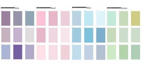
Once the idea of the tempos was accepted, then the next task was to assign a specific color to each section: News uses red; Show & Culture use purple; Sports uses orangeThis facilitates access to each of the sections, starting on Page One of the newspaper.
The weekend
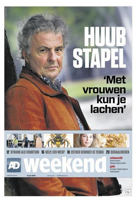
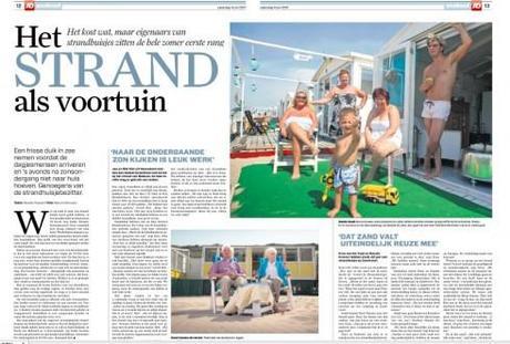
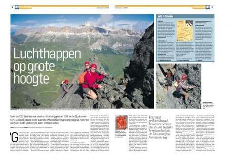
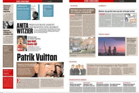
Typical of other Dutch newspapers, the AD’s weekend edition is jam packed with supplements, special sections, longer features. We decided to create some special story structuring for this edition, some of which we show here.
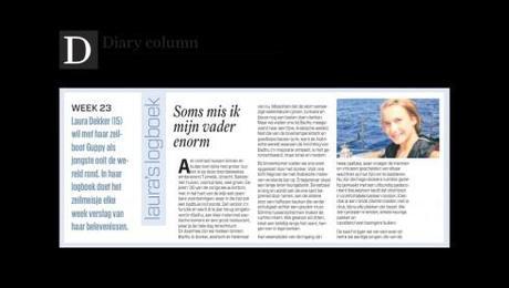
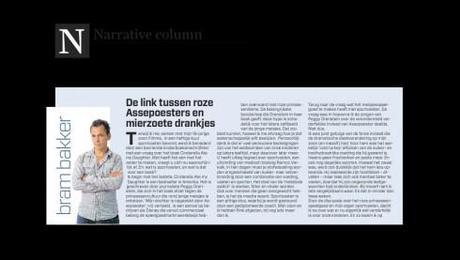
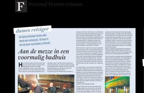
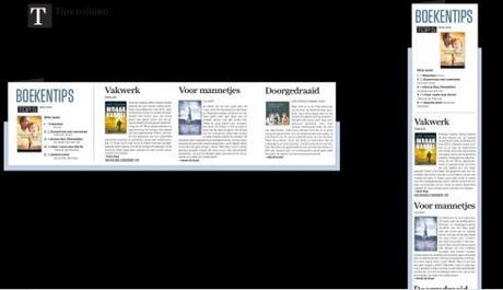
One of the steps we took was to analyze the type of columns that appear in the Weekend edition of the AD, and then create visual styles for each of them.
Here is a newspaper that publishes columns that are traditional single topic narratives, but also columns known for their service and the number of tips they offer; other columns are purely short takes on a variety of topics, but not necessarily service oriented. However, in the old AD, these columns all looked the same.
We show you how we differentiated the styles according to personal columns, narratives, service, tips, etc.
The reactions
According to editor in chief, Christiaan Ruesink , the results have been mostly positive since the June 3 launch of the new look:
What we’ve hoped for, became real. We hoped that with a soft launch of the new logo and layout and an explanation from me why the changes are made, the reactions would me minimal. A few letters came the day after. Most of them from designers complaining about the new font (Tungsten), but also from many readers who are saying: this is a new newspaper, but it’s still my newspaper. It’s the old AD in a new jacket. Compliments for that.I spoke to advertisers and professional journalists and they all said it’s much better. It makes the newspaper more classy, but it’s still a popular newspaper. Especially the new Weekend-section (in light-blue) compliments for that, too.
And, in the view of AD’s general manager, Eric-Paul Dijkhuizen:
It all worked out beyond my expectation. You know I am not born with ink on my hands, but I have ever since my many Disney years developed a very good understanding of branding and creating quality experiences. You have helped us to bring out the quality the AD was hiding for too long. The stories were good, the news was well covered, our journalists were on the ball and they still are. But since June 3th their stories are presented in a tempo and style that goes with the quality they deserve. And our readers are noticing that as well as our business partners do.
In terms of specific reader reaction, Eric-Paul mentions this one special note from a long-time reader of the AD:
One of the most moving letters we received was from a subscriber to the AD that is already for 52 years a member of the AD ( that’s how subscribers to our AD call themselves, members). He wrote : “ I am not a great believer in change and I read your paper for 52 years now. But the changes you have made, I like very much. Your paper enriched my live for many years and it still does”.
Balance,more class, improved readability are among the words I pick up when people comment on the new layout.
The weekend section of June 4 th was the best ever produced by the AD.
The team
Christian Fortanet and I worked closely with the AD’s art director, Jeroen De Haas, during the process which lasted six months. For those who would like to see daily pages of the AD, it is possible to download the AD app through the iTunes store, free of charge.

