Happy Friday! Oh my goodness, this was a long week. We are racing towards the holidays and CT-Designs will soon be literally BURSTING with news, MORE end of 2012 posts and things to look for in 2013. First up though, I've got a little potpourri burning that I think you are going to enjoy...
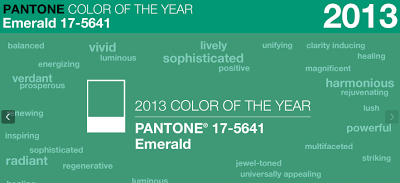
Pantone's 2013 Color of the Year: Emerald 17-5641

Pantone reveals color of the year: Emerald
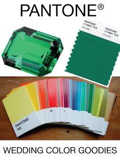
Emerald. Finally. A color I can agree with as it translates to weddings! Pantone's past "color of the year" selections have not really been consistent with the wedding trends I have personally observed (2012: Tangerine Tango | 2011: Honeysuckle).Emerald, however is right in line with what I've been seeing. My birthstone (I'm a proud May baby) is seeing a triumphant return to wedding palettes. Not to be confused with the infusion of "mint" into wedding palettes, this emerald is being described to me as a "grass", "moss" and/or "vibrant" green.
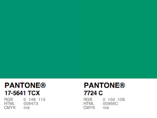
Looks like PMS 7724 C is the ink swatch equivalent to the TCX (Cotton) color chip:

Green can be paired with Navy, Khaki, or you could even use this green with all different hues of green. Nice fresh, eye-catching palette! I'm really getting excited for 2013.
Pantone Postcards (Who knew?)

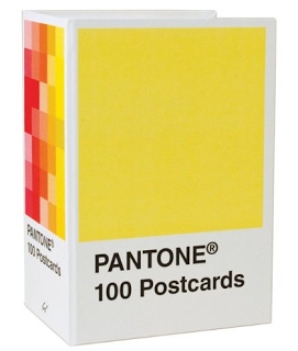
Oh my goodness, a fellow print/paper enthusiast alerted me to another hot Pantone craze: Postcards. I know it sounds weird, but stay with me.
You can purchase a box of 100 - 6.25" x 4" Postcards from Amazon for under $15. After being a print production manager for over 15 years, I must say that some of these Pantone colors can become pretty meaningful. After a complicated project, you will REMEMBER how much stress PMS 185 caused you. You felt the pain of Reflex Blue. You muscle through the frustration of achieving just the right orange...
As a result, you can decide to use these cards a number of ways. One great idea is decor for your office. Nice and clean, I'm already picturing these cards lined up either according to hue, or maybe just some of the most easily identifiable clustered together. You can also mail them to a colleague, or even use them as part of a marketing campaign. Truth is, I'm not 100% sure of all the uses for these over-sized chips, but right now, they are just cool. Cool enough to own. I'm planning to purchase asap!
Let me know what other color goodies are out there, especially for weddings! Also, be sure to check out our other recent post about other 2013 wedding colors to watch out for.
Take care and have great weekends...
--ct

