Picasso’s more than 50 shades of gray and what we can learn from the master
TAKEAWAY: An exhibit at the Guggenheim in New York City reminds us of the power of black and white through the works of Pablo Picasso.

Purchase the book on the iBookstore
“iPad Design Lab” trailer on Vimeo.
The EPUB version of book is HERE:
To all of those who are writing to let us know that you can’t buy iPad Design Lab: Storytelling in the Age of the Tablet, in your countries, or for your tablet or phone, the good news is that we have completed the EPUB version and it is ready for download via Amazon.com for Kindle:
http://tinyurl.com/8u99txw.
TAKEAWAY: :An exhibit at the Guggenheim in New York City reminds us of the power of black and white through the works of Pablo Picasso.
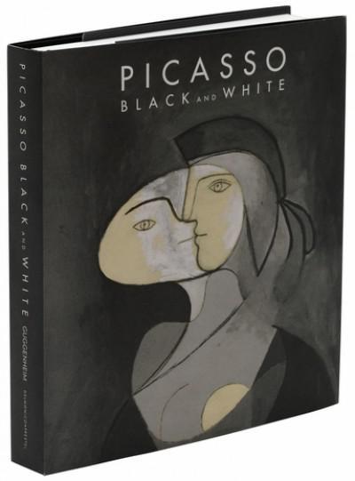
The exhibit’s book
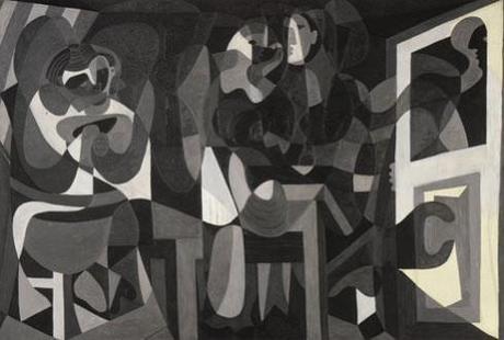
One of the Picasso works in the exhibit
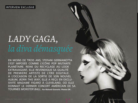
Madame Figaro magazine

hot to spend it (Financial Times)

Huffington.

Money Magazine
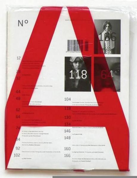
No. A magazine
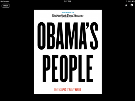
New York Times
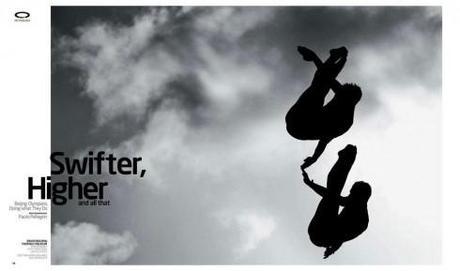
Play (sports mag of The New York Times)
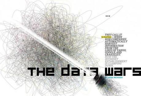
Wired
It is with great interest that I notice that a new exhibit is underway until January 23, 2013 at the Guggenheim Museum in New York. Titled, Picasso Black and White, it is the first exhibition to explore the richness of the Spanish master’s work with just the use of black and white.
Pablo Picasso, shows us that perhaps there are more than 50 shades of gray.
Ask any newspaper or magazine photographer what she thinks of black and white images, and you immediately get their attention.
Ask media designers what represents the most therapeutic detour for them, and the answer will be a page that resonates with black, white and gray.
Ask me what is even better: a canvas that is all black and white, then you come in and give it a touch of color—-orange, green, purple—-just a splash, and the visual contrast engages and seduces. All of the examples I have selected here apply the technique with much success. Black and white are the protagonists, but color comes in to add dimension, to surprise, and to make the package complete. But, see also those examples where it is only black and white, projecting elegance in 10 seconds. Picasso apparently knew that well.
The exhibit’s publicity pays particular interest to the fact that while we all have read plenty about Picasso’s styles and subjects, the recurrent motif of black, white and gray “is frequently overlooked.“
For us who design on any platform, there are lessons to be learned here. Simply because media research often reminds us of the audience’s preference for color, it does not mean that we can seduce and surprise from time to time with the impact of black and white—-and, of course, with color as a very secondary element if appropriate.
This new Picasso exhibit at the Guggenheim should serve as inspiration for all of us, regardless of which tablet we are designing for.
Picasso Black and White exhibit:
October 5, 2012–January 23, 2013
http://www.guggenheim.org/new-york/exhibitions/on-view/picasso-black-and-white


1st Middle East News Design Conference

It promises to be a great program, and a historic one, too: the first SND Middle East gathering. Put it on your calendars: November 8 & 9, in Beirut, Lebanon. Sponsored by An-Nahar and SND.
For more information:
http://www.snd20events.com/conference/

