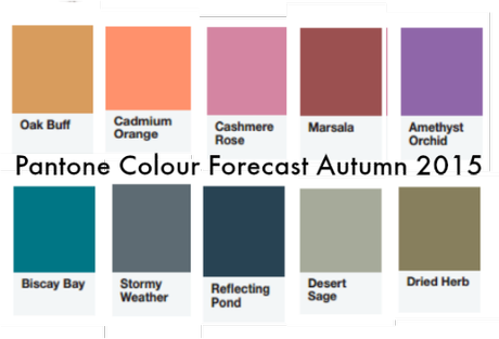
Pantone have just released their Autumn/Winter 2015 color forecast so I wanted to share it with you.
What’s interesting is that we’re moving away from the brighter colours of the past few years, the bright orange, emerald and cobalt and towards a more muted palette which is great for many people who find the bright colours too overwhelming.
Those of you with warm colouring will be pleased as more of the forecasted colours are on the warmer end of the spectrum, though fortunately there are still a few cooler colours to choose from. My favorite universal color teal is back in the form of Biscay Bay.
What is great is that there are some good neutral colours included (that aren’t black) for both warm and cools. Stormy Weather and Reflecting Pond for the cools, and Desert Sage and Dried Herb (and even Oak Buff) for the warms.
I’m going to do some posts in coming weeks about wearing each of the colours and how to combine them with other colours.

