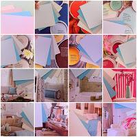
 It's no secret that choosing colours for a home renovation is both exciting and daunting. Every time you think you've found your pallette you see another picture in a magazine and wonder if you ought to make a swap... then you walk into someone else's house / shop and see your idea and realize it's perfect - or not quite right... oh and then you see a paint add that tells you what's all the rage and you wonder what if...
In trying to get a beach house colour palette recently, I thought I had it nutted down to 4 shades; sand and stone for outside and lots of white with silver and aqua features for the interior... of course those terms hardly truly describe colours that could just as easily be called champagne, coffee, moonlight, teal... or sand-bank, crab-crest, shell-side, surf-wave... and so on and so on for all infinity (what a wonderful job it must be to name colours!)
I arrived at the color scheme through trial and error, research of multiple magazines and library books on the subject of beach houses, cottage, retro family homes etc. To stop my mind spinning out of control and trying to help explain to someone how those colours look when combined with furnishings of different shades, I used a quick trick:
- Get the biggest color swatches you can, in your preferred shade or close to it.
- Fan the colours out side by side to see how they go together.
- Now lay the colour-fan over the top of pages in a colour-book or home-magazine.
Although the images in the corner can't possibly help explain what the real colours looked like when I did the exercise, I was able to show someone that a color scheme which was essentially silver-aqua worked fine with greys, blues and greens (as you'd expect) but also with pinks. Orange and dark browns were not too bad, yellow was going to be a tricky depending on the shade, and so on.
Next time you're wondering about which colours to use, try this test as a way to reconfirm your choice, and take some of the guess work out of what complimentary colours you should be able to add later for extra interest.
Regards,
Linda.

