Psychology Magazine
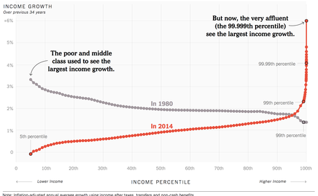
You probably have seen this chart from a NYTimes article by now, but I want to pass it on just in case. Also getting it into the list of MindBlog posts makes it easier for me to search for and recall it. The graph shows income growth over the past 34 years versus income percentile for those living in 1980 and in 2014.


