I've recently been in the process of moving from my current 3D studio in Dalston, to a larger (and much closer to home) one in Bethnal Green. So whilst all the materials and equipment that I normally use for making sculptures have been boxed up ready for the move, I've been working on some paintings in my 2D studio.
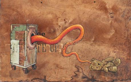
 For a while now I've been tinkering with the idea of doing some 2D and 3D cross-over pieces. One line of enquiry that I'm eager to pursue is a series of painted tower and box sculptures; either brightly painted in single colours, with possible tonal variations, or with intricate designs, like tattoos. However, whilst sorting through my store of old wood, I rediscovered some sections of early twentieth century packing crates that I'd been collecting. Because of their characteristic patinas, stains, and old labels, I like to use them in the construction of my box and tower structures. But this time I thought that I'd use some of the plywood to paint on. In this first one, 'Tentacle Touch Teddy', I made a start on the cross over process by depicting an image of one of my wheeled, orifice boxes on the surface of the very material that I normally use to construct the sculptures themselves. There's also something very satisfying about painting on a rough, and untreated mid-tone surface (and working with its existing idiosyncrasies), as opposed to a pristine white one.
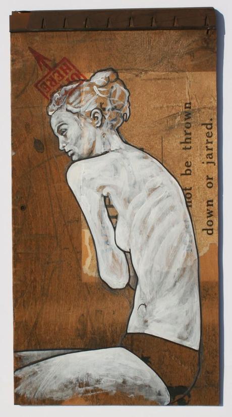
 For this second piece, which is more of a quick painterly sketch, I was fascinated by the woman's almost disproportionately long torso; a detail I then accentuated by making it a fraction longer. Apart from the black marker lines I chose not to add any dark shading to the piece, and instead let the actual color of the plywood fill in for shadow.
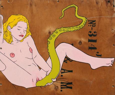
With this third painting, which I'm trying to fight the urge to call 'Octopussy', I wanted to use a flat Pop Art/cartoon style to create more of a contrast between the paint and the plywood's natural surface. I also wanted to come up with a contemporary take on the traditional Shunga prints of Japan. And in keeping with the Japanese theme, I incorporated the octopus tentacle (now a heavily eroticised image in much of the material that comes out of Japan), but subverted its presence by having the woman use it for her own masturbatory purposes, as opposed to the usual phallus metaphor that has the tip end of the tentacle exploring and attempting to penetrate.

