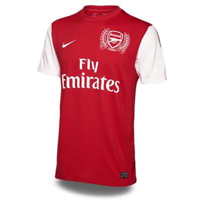
Arsenal(Home)
 3.5/5
3.5/5I know you guys have seen this shirt in one of Zach's earlier kit articles. This is the officially unveiled version of the new Arsenal kit. I am going to start off by saying that I don't like the crest at all. The leaves hovering around the Arsenal logo look stupid and I don't like the fact that it is just a white crest on the red jersey. I know they want to commemorate 125 years of Arsenal but why not use the cannon logo jersey instead, or use it as a reason to pull these bad boys back out. The one main difference from the leaked pics that we have seen is the thin red line down the side of the sleeve. A nice touch because otherwise the kit would be really plain. Overall it could have been worse and I guess in time I will get used to the distracting crest.
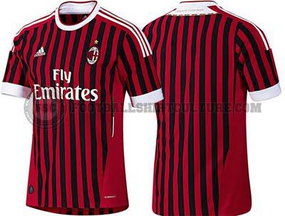
AC Milan(Home)

5 yard penalty/5
I really don't understand what happened here. AC Milan have had basically the same formula for their kit's for as long as I can remember. Substantially thick black and red vertical lines on a current Adidas template. Simple as that. This time they decided to let Adidas give them this black and red referee disaster. Not much else to say with this one.
Bayern Munich(Home)
4/5
I am feeling this Bayern Munich home kit. I think it was good that they got away from the white stripes that they have been rocking for the last two years. The gold is a nice touch and really makes it feel new and different. Their kit had gotten stale and it was time for an overhaul. It looks as if they darkened the red a little as well and that goes well with the gold accents.
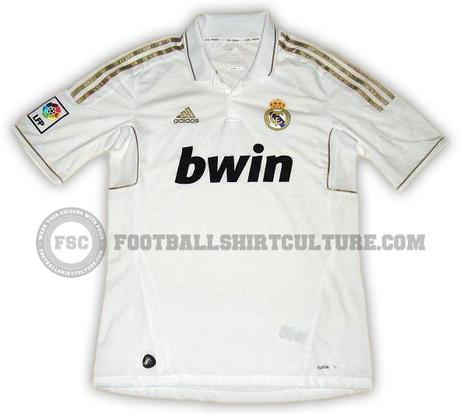
Real Madrid(Home)

0/5
This kit flat out looks cheap. I just went on and on about how I liked the gold trim in the Bayern kit. Well I absolutely hate it with this Real kit. This gold looks too shimmery for my taste. It just doesn't fit well with that white. Add to that the fact that I am not a fan of that template at all. I don't like the boxes under the sleeve or the collar. I like collars best in plain and fitted type of kits like the white England WC kit, the blue France kit and the new Everton shirt. This Real shirt just flat out does not work at all.

Liverpool have announced 25 million pound a year agreement with Warrior Sports. That deal will begin with the 2012-13 season. The 25 mill deal bests Manchester United's 23.5 million pound deal they currently have with Nike. Financially this was a no brainer for Liverpool. That is a ton of cash coming in every season. I just hope Warrior knows what they are getting into. Hopefully they will put a lot of thought and innovation into the kit because if I am not mistaken they only deal with Lacrosse and Hockey products.
