TAKEAWAY: The new Matthew Carter font is a welcome addition to the sans families. If you are looking for classy, elegant and distinctive characters for that special project, take a look at Carter Sans. ALSO: Bild introduces iPad2 in its pop up moment today
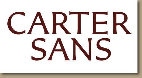
Take a look at Carter Sans

Image from http://cartersans.com/


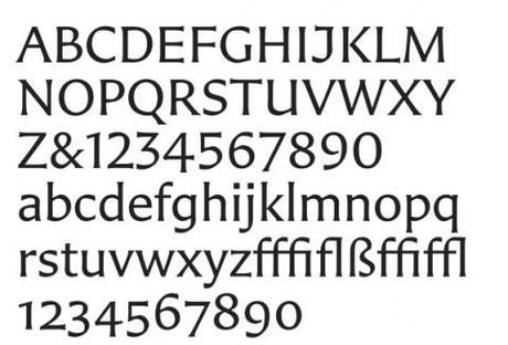
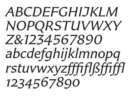
Images taken from Imprint.printmag.com
We have admired Matthew Carter’s fonts for as long as we have been in this business. Carter is, indeed, unique among type designers in having designed type in every medium that has existed since the era of Gutenberg: metal, wood, film, and digital.
Now Carter has a new font, the first one with his name attached, Carter Sans..
He discusses Carter Sans in an interview that you can follow in Imprint, the online community for graphic designers:
http://imprint.printmag.com/type/an-interview-with-matthew-carter/
I have taken a look at Carter Sans and it offers that elegance and style that we sometimes seek and that many of the existing sans fail to deliver. I plan to take a closer look and perhaps utilize it for upcoming projects.
Personally, I see it on the glossy pages of magazines more so than the dirtier newsprint of most newspapers.
Go to the Carter Sans website with images and additional information: http://cartersans.com/
Today’s pop ups

See Bild’s app introducing the new iPad2
The new iPad2 is here, and the buzz is global. I was in Dubai when Steve Jobs made his surprising appearance to introduce this new member of the Apple family. Everyone is happy to see him on the stage, as he is on a medical leave to deal with an unspecified illness. Now in Hong Kong, and the conversation is all about “when are you getting your iPad2?“.
Frank’s pop up today is from Bild, of course, and how it introduced the iPad2 with headline that describes it as “Skinnier, Lighter, Faster”.
I am hoping to get my iPad2 as soon as return home to the States. For now the “old” iPad continues to do its job well!
The iPad2 versus Xoom comparison from Bild
Frank has just picked this up from the Bild app, a good comparison of the iPad and the Xoom:
Bild conducted a test and here are the scoring points, the headline /summary report:
Design: iPad 8,8mm( 590g ) ;Xoom 12,9mm ( 700g)
One point for iPad
Touchscreen:Image quality equally good
Cameras: Both have 2 cameras/hd quality
Performance: both have dual core processors
Connectivity: Xoom has mini-usb; iPad does not
1 point for Xoom
Accessories: The new “smart cover” that has the control for on and off button; great idea from Apple;
1 point for iPad2
Pricing: iPad2’s price,starts at US$499, or 357 Euros; Xoom 700 euros
There are 5 iPad2 models less expensive than the Xoom
1 point for iPad2
The iPad2 wins!
Of interest about iPad2 launch
Apple iPad 2: What It Feels Like
http://www.thestreet.com/_yahoo/story/11030091/1/apple-ipad-2-what-it-feels-like.html?cm_ven=YAHOO&cm_cat=FREE&cm_ite=NA
iPad 2: The tale of the tape
http://tech.fortune.cnn.com/2011/03/03/ipad-2-the-tale-of-the-tape/?source=yahoo_quote
TheMarioBlog post #723

