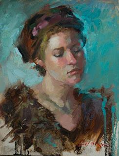
Old and New
18 x 14 oil on linen

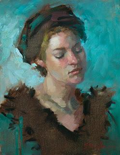
Original incarnation of Old and New
It struck me that what I wrestle with is exactly that: generic vs specific. While a stylized tree is still my preferred form when I paint landscapes, I'm less likely to create a generic face in my figurative work. In fact, I've become more specific over the years, trying to render the small changes of color and plane that create a likeness, instead of stopping at the big shapes that simply depict a person of a certain age or sex. (Can I type that word in a blog, or will it now be flagged as inappropriate content?) And yet I think of myself as a firmly contemporary painter.
So how does an artist marry the two - specific and generic - without making a clunky, incoherent painting? For me, it's a matter of putting something of the generic and stylized in the piece; that might be colour, texture, brushwork, or form. Without this non-specific element, the work seems too representational and I wonder why I didn't choose to be a photographer instead of a painter.
"Old and New" is an example of this aesthetic decision making in action. The original version leaned more toward the real with its suggestion of texture in the woman's fur collar and folds in the hat. But it seemed dull to me when I was finished. (I did like the drips, though.). I wasn't really pleased with it until I'd scraped the collar and hat to flatten them and remind the viewer of the 2 dimensional canvas underneath the illusion of form and texture. Adding a few calligraphic, furry marks and my beloved drips completed the statement for me. It strikes a balance between specific and generic that makes me happy.
I'd be interested to see how some of you deal with the question of specific and generic. Send me an image and post them in a future blog.
Happy painting!

