Caitlin Hynes
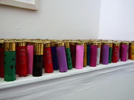
Roanna Scott
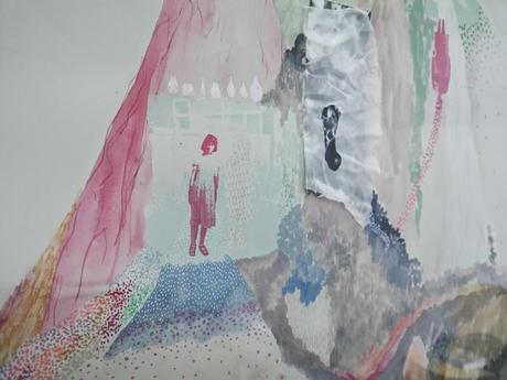
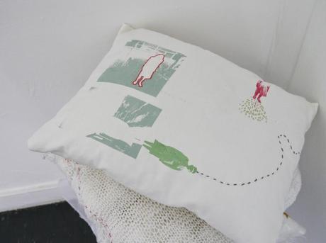
Siobhan Scott
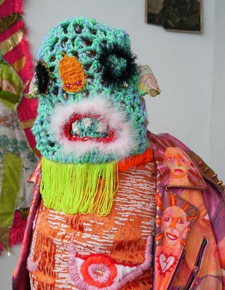
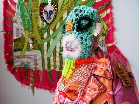
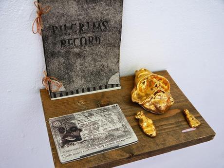
I was completely wowed by Caitlin Hynes space. It was a cacophony of colour, with interesting sights everywhere. From large sculpture pieces to small ceramics there was so much to see.
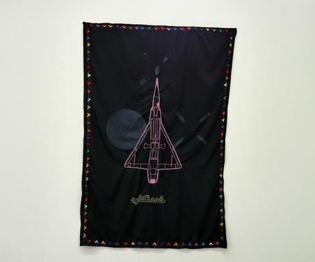
I also loved Rhona Scott's use of colour, especially on the shell casing piece. Her pieces looked a war from a more female perspective and investigated the use of flags as symbols within conflict.
Siobhan Scott used more delecate colours to create dream like pieces that mixed the everyday with abstract elements. I loved the colours and the addition of textile elements.
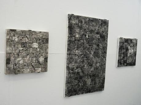
Robert Marjoribanks
Ericka Maskame Smith
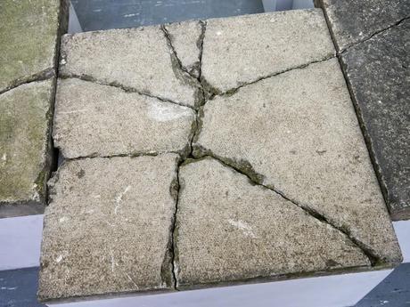
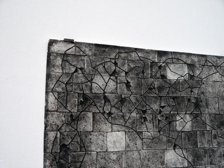
Robert Majoribank's work made art out of the mundane, taking paving slabs and making them into artworks with depth. His wall mounted pieces almost looked like city maps and the sculpture pieces were taken from Aberdeen's streets and placed in the gallery setting, with his own creations taking their place out in the world.
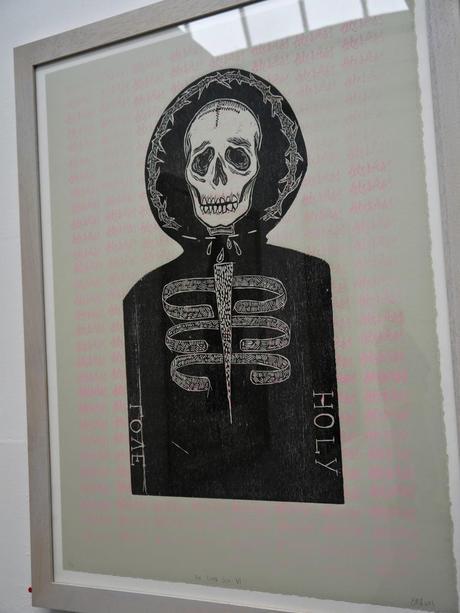
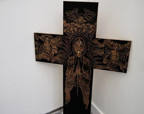
Ericka Maskame Smith's prints got me pretty excited. With their depictions of skeletons and death, they were detailed and interesting. And then I got closer and saw the subtle pink text in the background of some of the prints, giving their own subversive messages. I even ended buying a print to take home.
One thing I really enjoyed about the Gray's show was the fact the artists were on hand and wanted to talk about their work. Sometimes this can put me off (I just want to take pictures and write my blog) but these guys were engaging and just down right friendly. Definitely making it high on my list to visit next year.
