
- November 29, 2016
- 0
- Email This Post
- Print This Post
Find & Fix Floundering Web Content with the Latest Heat-Mapping Tools
In moments of retrospection, integrated marketers will invariably ask: how is my web content really performing? Are people reading and engaging with it? Or am I missing the mark and spinning my wheels?
Of course, Google Analytics and similar tools provide some engagement insights. But increasingly, marketers who want a quicker, less data-heavy dig-down are turning to visual heat maps to answer their usability questions.
User Behavior Revealed
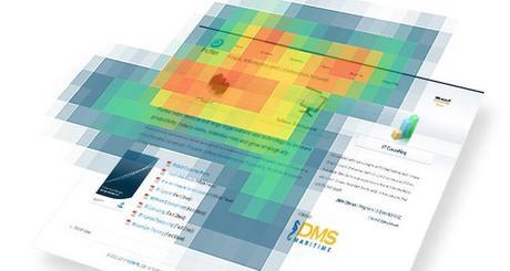
A heat map is a graphical representation of aggregated behavioral data that reflects users’ interactions with a particular piece of content, a display ad or home page, for example.
Marketers use heat maps to reveal otherwise ‘invisible’ information about actions viewers take (or don’t) while interacting with content, then use insights gained to:
- Visualize where in the piece users click, look or linger, and for how long
- Optimize content performance and conversions by changing poorly performing elements, such as graphics, copy, layout, and CTA (call-to-action) button design and verbiage
- Ensure that content and digital-marketing initiatives achieve their full potential and returns
Types of Heat Maps
There are numerous such tools available, each designed to map out different aspects of user behavior and interaction. Most fall into two common categories, according to conversion optimization firm, ConversionXL: mousetracking and eyetracking, although online advertiser, Outbrain, breaks these down further into Click, Scroll, Mouse Movement and Attention heat maps.
One of the differences is that mousing-activity heat maps collect data from actual users/visitors, whereas eyetracking studies are usually conducted (for a fee) by research companies that monitor a representative demographic sample in an unfamiliar ‘testing’ environment (think focus group).
Optimize Usability. Increase Engagement.
Here are some ways integrated marketers use heat maps to analyze and improve content:
Click Maps: help assess the effectiveness of call-to-action buttons; poor click through rates may indicate the need to change shape, color or verbiage.
Scroll Maps: reveal engagement level and how deeply visitors are going into your content; if they fatigue and lose interest before finishing the page or post, you may need to take actions to keep them scrolling, such as checking content relevance/quality; editing or chunking; or adding a video.
Attention Maps: help you identify whether on-page content, including media and navigation, is too busy, noisy or distracting; conversions and engagement often improve by removing or streamlining just a few selected elements.
Mouse Movement Maps: though simpler, cheaper and more widely used than eye-movement/attention maps, mouse-movement tools typically correlate to eye movement by as much as 88%; this fact alone makes them a favorite among SMB marketers who want to garner behavioral insight but lack a budget for eyetracking tests. It’s easy to see where any of these tracking resources could help with split or A/B content testing.
Want more? The Outbrain article features a side-by-side comparison of many popular free and paid heat-mapping tools, which is worth a look if you’re thinking about using a heat map. Another lengthy but fascinating article, linked here, shows visual results from 19 actual studies.
