There is one thing that is common in all good design and that is a timeless quality. The best designs seem not to age. When it comes to logo design, one aspect which can put your logo to the test is whether it is strong in just black and white. If it stands the test of grayscale black and white, it is quite likely that your logo has a strength, which will see it through time and remain as brilliant as the day it way created. There is always the potential to add colour and effects later to suite the times and fashions, but if the logos general form and composition is strong you’re on to a winner.
This post is looking at some of the best and most famous logos in the world. Some are timeless classics, others are new with modern colours and effects, which haven’t yet proven their longevity. One thing that is known is that a good logo can immediately sum up an organisation and it’s aspirations. A logo is how people perceive you to be. Good branding is not enough to create a successful business, but it is enough to convey that you are a successful business and therefore by capturing what you wish to become you can become it.
Below is our favourite logos each with a brief description.
The World Wildlife Fund’s logo is a timeless classic. It is bold and distinctive yet captures the cuteness of the much loved panda and the vulnerabilities it faces and the need for human support. All of this is conveyed using just flat tone black and white, yet the arrangement of these forms creates something that is recognisably 3Dimensional. The legs seem to also form a W, although perhaps that was co-incidental.
The Nike tick, instantly recognisable and much loved. Few companies have such strong branding than Nike. Very simple yet conveys the positive force which is Nike. Combine this with the slogan ‘just do it’ and put a pair on Michael Jordan and all the elements are there for extraordinary branding.
The Air Jordan Logo, so simple yet defined a time, a hero and all that a generation wanted to be – ‘I wanna be like Mike.’ The logo is timeless, unmistakably Michael Jordan, the man the myth.

Certainly in the same breadth as the Nike logo. This logo alone amazingly justifies a $3 product being worth $300. Strong branding certainly goes a long way.

The James Bond 007 logo is another timeless classic. The logo successfully sums up James Bond, sophisticated yet dangerous.
The Playboy logo successfully conveys a sense of fun. Bunnies are known for their sexual appetites, this combined with the bow-tie (a distinctly human feature) and the logo immediately conveys it’s message – sexy, cheeky, fun and at times maybe even a little sophisticated.
The Ministry of Sound is another black and white logo which successfully conveys 3Dimensions, but not only that seemingly conveys the idea of music. The logo is somewhat reminiscent of a sound system with the Base blasting full bore.
The DC logo is bold and utilises symmetry. The star gives it a desirable superstar cool touch, while the cut in the D helps to maintain the logos balance. Seems to capture a strong, I’m cool, rebellious image, which sums up their target audiences aspirations.
A world famous brand, Calvin Klein is striking and bold, yet controlled, balanced and elegant. Certainly conveys good design and fashion.
Doesn’t convey classy like Calvin Klein’s logo, but is certainly unique and striking and successfully conveys fashion. It conveys an optimism as it sours to the sky.
Another relatively simple, black and white logo, yet it’s simplicity gives it great strength, in this case, as well as many of the earlier examples, it is certainly a case of ‘less is more,’ In this case I assume the brand takes it’s name from the Founders surname. The text is relatively classy, the H, K and F balance well with the P balancing the portrait. The silhouetted portrait is very simple, but the human figure has a timeless quality and the framing of the portrait in this case elevates the designer on to a pedestal, conveying ‘I’m unashamedly great’ and who is going to argue otherwise. This confidence and boldness speaks loudly.

It would be interesting to ask a person who had never seen this logo to predict what type of Company this logo is for. Of course, Bentley create elegant and classy cars, but for me the logo seems to say nothing less. The wings create both a classy frame but also an optimistic symbol. This car won’t just drive, it will fly in elegant ease and comfort.
Relatively simple logo, yet it speaks volumes, instantly capturing all that is great about the olympics, if not humanity. The colours, like the South African flag convey diversity. The rings are all of equal size as every person is equal and link as one, united in a shared struggle. Coloured logos are not always easy to get right, but their choice of colours are strong and complimentary. See how differently it could have been (below).
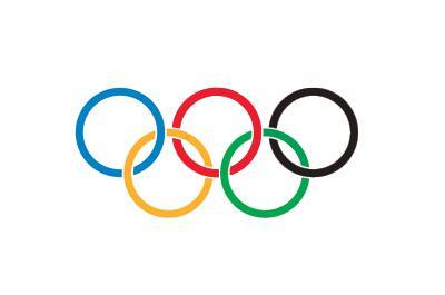

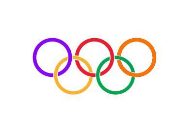
Not quite the same!
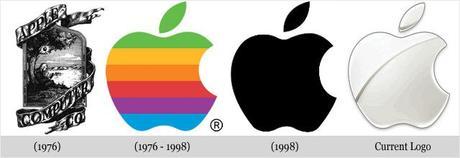
In a similar breadth of Nike and Oakley, Apple have successfully built up their branding to be a highly desirable logo. We all know and like apples, the bite indicates a human at work and the apple is even credited with inspiring Sir Isaac Newton to discover gravity = inspiration of genius. It’s evolved over the years but the classic, unmistakable apple form has remained as strong as the day it was born.

The Coca-Cola logo, certainly conveys fun, yet is reasonably classy, perhaps conveying a time when things were simler and care-free. Instantly recognisable, timeless and highly unique with it flowing use of curvature which frames the text. Like Oakley, it has afforded Coca-Cola to charge a significant amount for their products despite them being inexpensive to make. By having such high profits, they can invest more in marketing and they only get stronger and stronger and have since taken over the world.
The Firefox logo is actually one of my favourite logos of all time. The use of colours and form suggests that it may not be timeless in the elk of Nike, but the use of a primary colour (blue) matched with it’s opposite colour (orange) immediately makes it striking and complimentary. The forms and colours, despite being relatively flat convey the foxes 3Dimensionality and the foxes fir, create a flow which transitions to the fire. The logo seems to convey a sense of movement as the fox sweeps around the globe looking over the world in a protective manner. Had the fox been looking at the viewer, this message and the message conveyed would be entirely different.
Similar to the Apple logo, the Batman logo has a strong and recognisable form. The yellow is now somewhat dated but by having the strong form, contemporary designers can use colours and effects to take it into the new age.
Le Tour De France Logo, certainly conveys that sense of adventure and madness that is le tour. It’s an artistic font which conveys an artists brush and is unmistakably french. The ‘O u r’ is cleverly used to create a cyclist. It’s fun yet seems to convey the history of the tour. The yellow blob or wheel is what every cyclist strives for ‘the malliot juene’ and the text slanting upward is both optimistic yet conveys the uphill challenge which is le tour.
The Australian Open Logo is another which uses the timeless nature of the human silhouttes. Like firefox, the logo utilises opposite colours (blue and orange), which successfully convey Australia. The Australian Open is played in the hottest part of the year in temperatures up to 40 degrees. This sweltering challenge is conveyed, but relief, the baby blue is in sight. It will be a physical test against opponent and heat, but relief is in sight and the blue balances out the heat and gives it a sense of fun, well suited to the young country.
The success of the BP logo is difficult to question and you would hope so for 4.6million Pound! If you had no idea about BP, from looking at this logo you would assume that it is for a company with a green agenda, one with bright ideas and an optimistic future. The reality is often some yard from the truth, but this is indicative of the power of good branding. A majority of people will often believe what they see. Unfortunately the logo somewhat backfired when BP was caught up in one of the biggest oil spills in history and they’re struggle to come up with solutions in a timely manner perhaps suggests they don’t have too many bright ideas, but great logo.

The NBA logo is another timeless use of the human silhoutte. This is actually another of my favourite logos. Although the colours have become dated, the strong forms allow the logo to be easily altered. Red, white and blue is also unmistakably American.
The Major League Baseball logo obviously hired the same designer. Why change a good thing? It’s certainly a winner, sums up the sport, the nation it’s played in and conveys an authority – this is the top league.
Although the colours are a little dated, it is difficult to argue against the success of the superman logo. Put this on a muscly mans chest, with massive shoulders (similar to the shape of the logo) and who wouldn’t believe that they’re a super hero. It’s bold, strong, but the s also has a friendliness with the bubbled end, giving it a softer, good guy feel.
This logo seems to capture all that is great about Australia. The text is friendly and fun, the Kangaroo conveys the beauty which is Australia and that sense of adventurous spirit and the sun conveys the heat and the outback. The sun effect on the Kangaroo is very successful, with an extremely arty effect. The logo is very inviting, almost as though asking ‘why not?’
Quite opposite to the Australian Tourism Logo, yet no less inviting. This logo speaks of indulgence, opulence and sophistication all that you would expect for your money if you visited the Bellagio.

Similar to what the BP logo conveys. The use of colours is indicative of fresh and green, innovative, creative and optimistic. Green and blue speaks of nature and environmentally friendly is the way forward. Melbourne paid a lot of money for this logo, but well spent in my opinion. The shards of light create an artistic touch, indicative of the strong culture on offer, yet the form and fonts are bold, creating a sense of confidence – ‘Melbourne is going places so why not invest here and come along for the ride.’

Again a similar colour scheme as the City of Melbourne logo. Trams are unmistakably a more environmental option compared to cars. It is much softer than the City of Melbourne logo, but if you were unreliable and always annoying people it is tactically wise to play a softer card.
This is a strong image, an image for the dreamers. You can just imagine the boys imagination running wild sitting on the moon, who knows what he’s about to catch. It’s certainly conveying a positive, creative brand, with plenty of ideas in their ocean.

There aren’t many logos that are so recognisable. So much is it’s success that the format has almost been repeated for everything. It’s certainly helped to create loyalty and made New York a most desirable place to visit. New York is one of the biggest cities in the world and is known for it’s fast pace and even it’s hard edge. Interestingly this logo is extremely soft. The text is almost jelly like with undulations and soft curves. There are no hard-edges in this font and this is one of the reason’s it is so popular and successful.
Whatever Michael Jordan was associated with made the branding exercise very simple, but the Bulls logo stood on it’s own two feet. The Bull is unmistakable fierce and just in case you didn’t realise it is raging red with blood stained horns. ‘I’d probably just get out of the way or you’re going to get hurt,’ chuck Jordan, Pippen and Rodman into the equation and you really should just get out of the way.
The Rolling Stones logo is one of the best examples of a timeless logo which has used a bit of colour. As relevant today as when it was born, it still speaks of rebellious fun, sex, drugs and rock’n'roll. The human body is timeless and this is another clever example of using it to convey something anyone can understand, anywhere, anytime. The forms and use of white creates the bubbly fun nature.
The Google logo is extremely unexpecting. Who by looking at this logo would be able to imagine that Google is one of the largest companies in the world? This is the reason the google logo is very successful, because it suggests no ambition. It conveys a playfulness and it’s unassuming nature makes people feel comfortable in the company. The colours are the three primary (red, yellow, blue) and a secondary colour (green), they are child’s play. But in reality Google is powerful and ambitious, buying out 37 other businesses, including Youtube. Google+ also indicates that they are not content with just being the biggest search engine but they are also keen to cut into Facebook’s dominance in the Social networking. But overall people have a fond association with Google and I believe the logo goes a long way to establish this. Everyone barracks for the underdog and despite google being enormous, there logo would suggest otherwise. By changing the logo on almost a daily basis, they continue to strengthen their brand and get people talking about them, creating a customer loyalty.
‘You just want to be there.’ If drinking Malibu is the next best thing, I’ll take it.
One of the best logos in modern history. The 1egg1world charities logo is both bold and instantly recognisable. Ok maybe I’m biased haha, how does our logo stack up against the greats of all time? Feel free to comment.
MORE COOL LOGOS







Wouldn’t be fair to discuss famous logos without talking about McDonalds. It’s pretty ugly really but the golden arches as they are affectionately referred to are certainly recognisable. The gold also stands out immediately from the street, helping kids in the car to spot it from miles away and nag their parents to give way to temptations.
