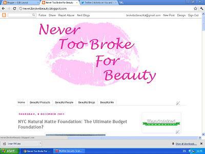
The old Never Too Broke for Beauty
Never Too Broke for Beauty has had a face lift! I'm still relatively new to blogging and when I started out I wasn't sure what I wanted my blog to look like. I'm not the most technical person so was somewhat limited as to what I could do in terms of designing a logo. For some reason I chose a pink logo even though it is not a color that I like. I had an idea of what I thought a beauty blog should look like; I thought it should be feminine and soft and appeal to a female readership so I went with pink, however I hate pink and the design I went with was not reflective of me or my blog.
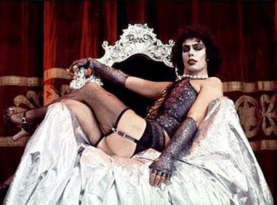
Dr Frank-N -Furter I love you!
The only part of my blog I did like was the lip motif. The lips were supposed to be a homage to The Rocky Horror Picture Show but this was lost with the pink color scheme. I'm a HUGE Rocky Horror fan and I feel that the film is reflective of me and my interests. I love gothic horror, musicals, 50's science fiction films, lipstick,am interested in gender, things that subvert norms and am a total film geek. The Rocky Horror Show has everything I love plus it has the Time Warp and Dr Frank-N-Furter! It is the perfect celluloid package, it is also my go to film to give me a pick me up when I am feeling a bit down. I feel like my blog design is a little nod to The Rocky Horror Show and therefore more of a reflection of me.
Remember readers: Don't dream it, be it!
What do you think to the new layout? Feedback is always appreciated.
