This is the weekend edition of TheMarioBlog and it will be updated with more images of De Telegraaf Friday
TAKEAWAY: It’s a new weekend edition for the Netherland’s iconic De Telegraaf; here is a case study of the change, including a redrawing of the newspaper’s logo by Jim Parkinson.
Weekends just became better for De Telegraaf readers
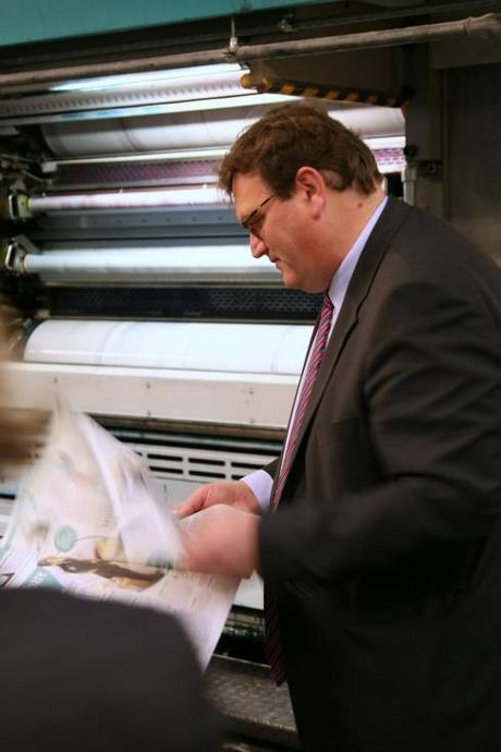
Editor in chief of De Telegraaf, Sjuul Paradijs, reviews first copies coming off the press this weekend
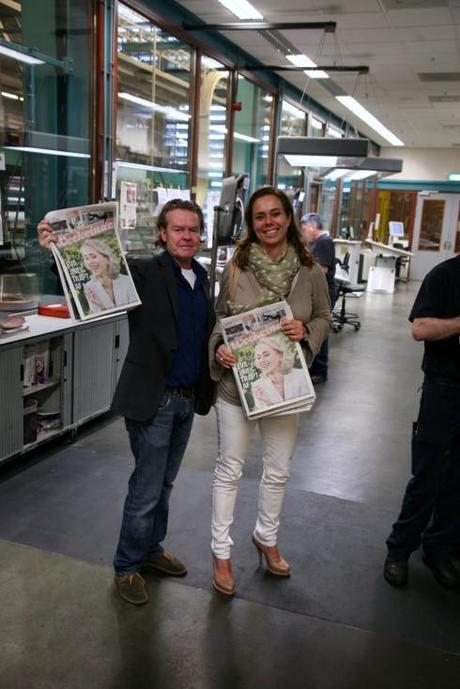
Photo editor Frank van der Vleuten and Weekend section editor Babette Wieringa proudly hold up first sections off the press
It is a new weekend edition of the Netherland’s De Telegraaf.
And for me, as a consultant, to be involved with this most iconic of European newspapers, has been an honor. It has been intense, but exciting and challenging, work.
The edition of De Telegraaf that you see today is full of surprises, but they are not at all of the cosmetic kind, although you will see changes in that area too. Among the things you are likely to discover as you sample your new De Telegraaf over that second or third cup of coffee:
A newly rethought Weekend section—full of useful, entertaining and appropriate content to make your life better, healthier and more fun.
Content rhythm that has been studied and rethought, so that you will get the most appropriate flow from section to section. A clean and updated logo for De Telegraaf. More on this later on in this piece.
Weekend newspapers evolve
Media companies around the world are paying more attention to their weekend products.
Most recently I have been involved as a consultant working with the Sunday edition of The Washington Post, another iconic newspaper with great journalism and a desire to improve its offerings for an audience that gives its newspaper more time on weekends. It is all about readers and their use of time.
We all live in a world where time pressures are many, especially for families with young children, where both parents work. The Monday through Friday window of opportunity to read the newspaper leisurely is just not there—or not as ample as it used to be even five years ago.
But, oh, the weekend is where we lean back, take off our shoes and go somewhere with our newspaper, to enjoy, to get deep into subjects, to get tips and to make us smarter conversationalists.
A weekend newspaper is supposed to do that: the new De Telegraaf has been rethought with that idea in mind.
The process
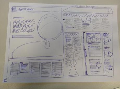
One of my early sketches for a double spread of the new tabloid weekend section of De Telegraaf
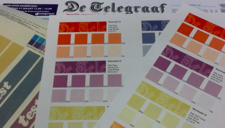
View of the color palette we created for the Weekend section
For months, I have worked with an enthusiastic De Telegraaf team; Hans Hansnoot, design editor, Babette Wieringa, weekend editor and, of course, Sjuul Paradijs, the editor in chief ,discussing every page of the weekend edition, coming up with solutions, anticipating the readers’ desires and needs, and, eventually, creating a prototype that was printed and further analyzed. The result of this work is the newspaper that appears in newstands this weekend.
For a designer, a first contact with the pages of De Telegraaf can inspire a mix of surprise, fear and the feeling one gets when standing at the top of the Empire State Building: a wow, where do I look first?
But the visual chaos that is De Telegraaf, where I have examined decades of copies in a bound book nicely displayed in editor Pardijs; office, tends to grow on you.
Boxes from the 50s, shadows from the 60s, columnists logos from the 70s,, all preserved as in a catalog.
Fortunately, we were not charged with changing the news sections of the newspaper. Only creating the weekend package.
But, as I told the design director, this new Weekend edition must go inside the rest. We must find ways to create some visual cohesion here.
We accomplished some of that.
How?
From the start, I thought that the distinct logo of De Telegraaf could be the unifying element. But it had to play a secondary role. So I thought that a shadow of the logo, as if the letters were carved in the sand, for example, might be the way to accomplish this. And we think it works. The logo makes an appearance, but it is not the protagonist.
Since I had contacted Jim Parkinson, of
%0A">
%0A" title="Type Design">Type Design, to take a look at the newspaper’s logo and to redraw it, then I asked him to do the “shadow” version as well. (see below)
Looking at the logo
Jim did his usual great job. I have had a 30+-year professional association with Jim, whose portfolio includes hundreds of the world’s most distinguished titles, among them The Wall Street Journal, Rolling Stone, The Chicago Tribune, Los Angeles Times, Esquire, Fast Company, and The Washington Post.
“This is an iconic newspaper with great traditions, “ I told Jim, in way of a briefing.“We just need to take each letter and clean it.”
That is exactly what Jim did in his usual masterful style. The logo of De Telegraaf out this weekend is cleaner, more distinctive and more attractive.
It all worked well, as you can see here. And Parkinson appeared to be pleased, too:
“The De Telegraaf Logo was a pleasure to work on. The old logo had fallen into disrepair, so I tried to make it crisper and fresher while retaining its eccentric charm.”
The logo through the years
While the distinctive logo of De Telegraaf has undergone primarily size changes over the past 9 decades, it had never undergone quite the major redrawing and cleaning that Jim Parkinson gave it.
As I reviewed a book tracing 100 years of De Telegraaf, I realized that the original logo stayed the same from 1883 through 1921, when it was made considerably smaller (I assume that this was to allow for bigger ads as ears around the logo at the top of the front page); then in the 1960s came the next change, back to a bigger logo, only to reduce it in the 1980s to the size that it remains today.
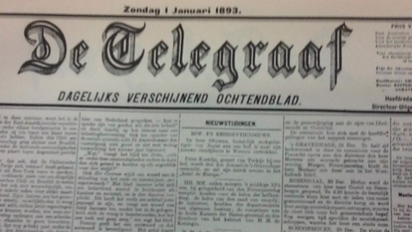
The original 1983 logo of De Telegraaf
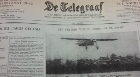
The smaller version for the 1920s
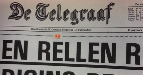
Then retooled in the 1980s.
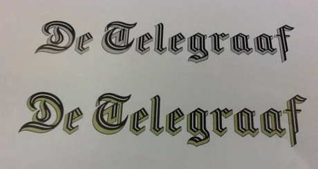
The new logo as designed by Jim Parkinson
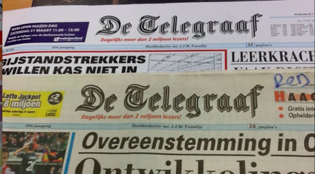
The existing logo and the new version that was introduced with this weekend’s edition
The shadow effect
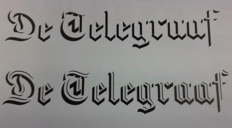
Here is the “shadow” effect for the logo
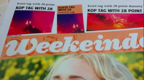
Here is how the shadow effect appears with logo of Weekend
From the start of this project, and knowing that it would be difficult to create any type of visual continuity when we were introducing a new Weekend Section and making changes in Reportage, but NOT truly touching the rest of the newspaper’s typography and design, I realized that I had to find something to tie it all together visually.
It occurred to me that if we had the distinctive logo of De Telegraaf, not as protagonist, but as a shadow, behind each of the sections, that would guarantee continuity, and we think it has done that.
Jim Parkinson also created a shadow version of the logo, in addition to redrawing the original logo that you see on the front page.
And, although my wish has been to carry this shadow logo through sections we did not touch at all this time: Telesport and Financiele, it was decided that perhaps that would be part of a future evolution.
I have the feeling that this is the start of changes for De Telegraaf. As with all new relaunches, we are paying close attention to what the readers say. De Telegraaf is a well liked newspapers, read by over a million readers.
This weekend, the legendary Telegraaf turns a new page, and even the logo is cleaner and easier on the eyes.
As I told the editors of De Telegraaf, the new logo should take the newspaper into its next 50 glorious years
Of related interest:
We covered the typography of De Telegraaf in Thursday’s blog:
De Telegraaf’s weekend edition launch (1): a conversation with type designer Saku Heinänen
http://www.garciamedia.com/blog/articles/de_telegraafs_weekend_edition_launch_1_a_conversation_with_type_designer_st

