Blogger Janelle and I have worked on a few projects together in the past; I’ve tried out her La Mere Layering Technique in one of m frosty morning outfit posts and she has already sent me photos of her favorite shoes for an upcoming Tuesday Shoesday blog post (join in here!). So when I asked if the Confessions of a Fashion Stylist blogger would be willing to do a color analysis for me, she was happy to help and got to work straight away. The first thing she needed was a clear photo of me without make up – my absolute nightmare as you may have read on my blog earlier this week! But I took the plunge and snapped a photo, then fired it off in an email to her before I changed my mind!
Janelle set to work analysing which colours would suit me best and sent me over a report along with a palette of colours to make my future clothing and beauty choices easier for me.
Eye Colour: soft blue/grey, changeable Hair Colour: Medium blonde with warm and cool tones Complexion: Ivory
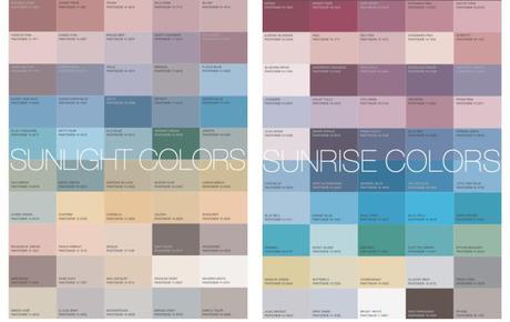
Colourtime: Primary: Sunlight Colourtime and Secondary: Sunrise Colourtime
Conclusion: Due to the fair and delicate colouring of the client, the colours that would suit her best are the colours reflected in the sundrenched hours of noon day. These are the muted and more subtle tones of the Sunlight Colourtime palette. These colours will compliment her colouring and not overpower and would be best as the main source of the colours she chooses for her wardrobe.
As a secondary palette of colours, meaning those which she should use to as the colours of accent pieces in her wardrobe, the sharp crisp colours of the Sunrise Colourtime palette.

I’m really pleased with the colours suggested in these palettes, because burgundy and blue are already my favorite colours and I have a few pieces in these tones in my wardrobe. I’ve been thinking about purchasing a forest green top for a while and according to my color analysis this would be a good color on me and I’d also be suited to wearing emerald green, teal or sage so I can keep my eyes open for some green additions while rummaging though the charity shops! I’m slightly disappointed by the quantity of lilac and lavender shades in both of these charts, because I wore a LOT of these shades as a teenager and don’t think I can stomach wearing it again! But I’m willing to give it a try and I might pick out some of the more dusky tones or rich purple next time I’m heading towards a changing room – I’ll at least try it on and see what happens to my skin tone when I do!
Janelle also sent me a link to her sunrise color combinations moodboards on Polyvore which showed how these different shades could be combined in outfits – making it super-easy for me to make the change to introduce new color combinations into my wardrobe. As a lifelong fan of black, I’ve been desperate to move away from dark shades and experiment with colour, so I’m taking inspiration from these color palettes to bring outfits together and I’ll share my new combinations with you soon.
Would you like your own color analysis done? Get in touch with Janelle at Sasha Bowman shops!

