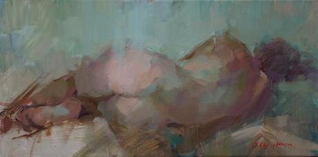
Warm on Cool
15 x 30
That's why the first marks are always the hardest. I spend a lot of time studying my reference, live or photographic, for ideas about the initial toning colour, the color of the drawing/block-in, and any elements that will be singled out for special colours notes (in this case, that was the bum).
This painting was done from a photo and the colours were very cool and neutral overall, mostly yellow greys with the warmer flesh tones being orangey-red. The reference suffered from lack of contrast and color variety with the background drape being almost the same color as the majority of the torso. So I stood in front of the white canvas for a ridiculously long time, trying to figure out an interesting color range. There were, of course, an infinite number of options that presented themselves to me, the most obvious being complimentary colours: blue and orange, yellow and purple, and green and red.
I decided on green and red because they seemed to suit the mysterious, secretive quality of the pose, and they would allow me to use rose in the rump. Then I chose which type of green I wanted: warm or cool. I chose a cool, bluish green rather than a warm yellow green, feeling that cool better suited the mood of the pose. Pthalo green seemed right, though the weaker viridian was in the running.
For the shadows on the torso, I used alizarin, a cool red, to make them recede in space and importance while still showing warm flesh. The rump got cad red light to bring it forward and to suggest greater warmth.
For yellow, I used mainly warm choices- cad yellow pale and Indian yellow - and to achieve darks, I added raw umber to my palette. Powerful darks could also be had by mixing pthalo green and alizarin, but sometimes they are too rich and overwhelming. Raw umber is a nice weak option.
I toned the canvas with a warm olive color to avoid an unpleasantly chilly painting, and then roughed the drawing and all darks in with a warm mixture of raw umber and cad yellow pale.
Next I placed color notes: warm bum, cool drape, warm transition areas, and waited for the painting to begin to suggest its next requirements. After all that careful and rational planning, it was time to relinquish some control and listen to what the painting was suggesting.
Suddenly got airy-fairy, didn't I? But there's no other way to describe it, and many of you know what I mean. If you're relaxed and attentive, the painting shows you the way; often by showing you when a mark or color isn't right. So you have to paint slowly, noting the effect of each mark as you place it and adjusting the ones that seem "off" before they get woven into the fabric of the painting and lead to a whole bunch of compensatory "off" marks. Marks that seem right get enhanced. They form the basis for extended color riffs on a theme. You just have to watch for them and follow where they lead, pushing gently to test how far you can go in that theme, backing up when you realize you've pushed too far.
Well, at least I told you the concretes of the first part of the process. The rest is mysterious and wonderful. I hope you experience it in your studios, too.
Happy painting!

