To produce pointed pen styles, the nib is gently squeezed and the amount of ink released is controlled by how much pressure you apply to the paper. For thinner areas of the letter, less pressure is applied. For the thicker portion of the letter, more pressure is applied.
The key to successfully rendering a pointed pen style is PRACTICE and TIME. It takes lots of time to perfect these letters as your hand has to develop a lot of control. Control is important, especially when you are lettering beautiful envelopes that have been supplied by clients! Pointed pen lettering can be messy, so be sure to ask for 10 - 15% overs for mistakes.
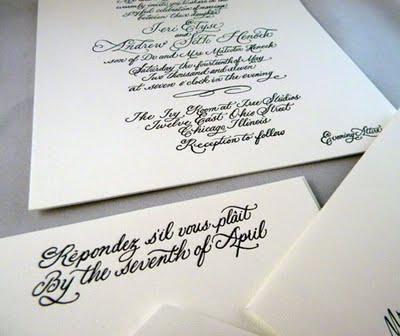
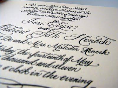
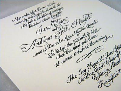
The following photos are the results of an invitation that I provided a custom copperplate style for. The printer converted my artwork to plates and the invitations were letterpressed. I discussed the planning process for this invite in an earlier blog post.
Enjoy the pics and I'll be back to talk about fun lettering styles that can be acheived with both the flat and pointed nib!


