With the Toronto 2015 Pan American Games (XVII) games coming to a close last night and the ParaPan Am Games slated to begin on August 7th, I think it's a good time to take a look at the city's branding for the event.
Here is Toronto's original bid logo from 2010 - based on an abstracted maple leaf concept that doubled as people. Its clean and the concept is sound but there is something about it that seemed oddly familiar and lacking in energy that one would expect from an event such as these games.
"The design is based loosely on aboriginal art forms found throughout the Americas, he said. The logo is three separate shapes in red, green and blue. They resemble a "T" and an "O" with a blob over the "T" that transforms it into a human-like figure. The numbers "20" and "15" are in white inside the letters."
![]()
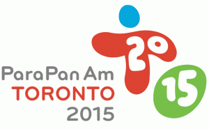
I prefer the new logo to the bid concept because it definitely carries an energy and spirit that you can better identify with the games. It's an awkward-looking blob-like mark but its childish, naive forms eventually warm one up the more they're exposed to it (in the same vein as Bruno Mars' Uptown Funk - for me anyway). The spirit of all games is play, and this is innately visceral, naive and unrefined, so it makes a lot of sense. The colour palette features a very wide spectrum - something that naturally comes hand in hand with this playful direction. Predictable but effective. While the rounded sans-serif is fun, something about it just doesn't seem to completely gel with the free-hand typographic style taken with the TO 2015.
While I have my reservations about the strength of the logo as a standalone image, I find this identity truly begins to shine in its overall application as an event campaign.
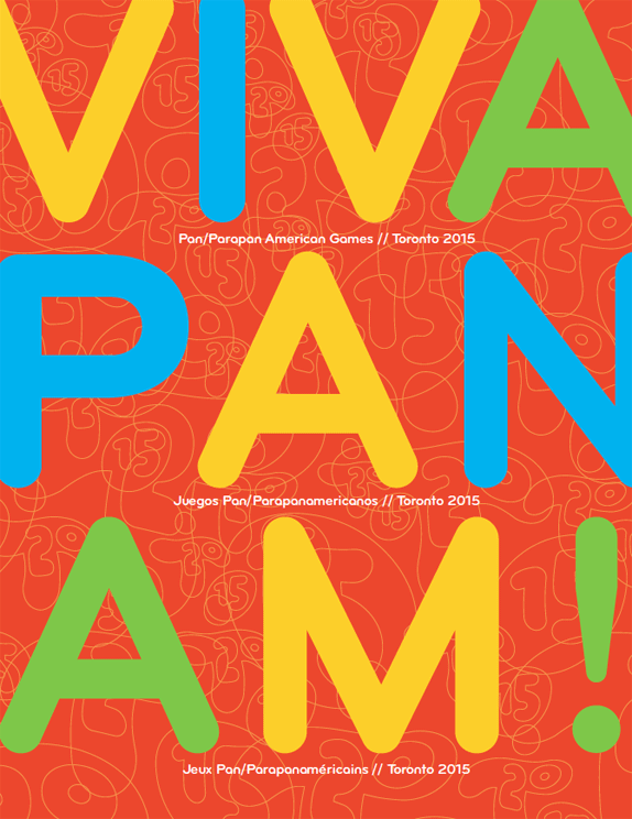
The free-hand style lent itself to the creation of a very fun and vibrant set of sporting event icons and from there, those abstracted shapes served as the backbone of a wonderfully executed overlapping texture. They also use a derivative of the TO 2015 mark, which was outlined, as an overlapping texture for the Pan Am Spirit Guide.


The signage is overly simplified and makes perfect sense to me - implementing the busy textures I praised above might've actually have made it more difficult to use as a wayfinding system. My only gripe with the signage is the non-descript abbreviations (PAP, RYA, ABL, VAR, etc) which results in a bit of a learning curve - but I guess if you know which event/venue you'll be heading to, it should be easily recognizable. Wayfinding systems, ideally should be clear, concise, highly-intuitive with a minimal learning curve.
Overall, I love how the brand has been rolled out in a very cohesive manner while really accentuating the colour palette and and diversity of these games.In this case, the colour is its single greatest strength and the glue that holds the branding system together. I've included a gallery (care of Flickr account: tohostcity2015) to showcase how colour has played such a prominent part in bringing the spirit of these games together.
Admittedly, the branding is too complex a system for a single blog post to do it complete justice - but I do feel overall, that it was a success.
All photos sourced from tohostcity2015
What are your thoughts?
Rene Tan
Graphic Designer
Mystique Brand Communications