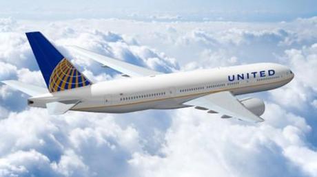
TAKEAWAY: A jet with United on the side and the Continental logo on its tail. A hybrid. A new airline in visual transition? Or is this what you call visual compromise?

Sitting in the lounge at Hong Kong’s airport, waiting for my flight to Frankfurt this morning, and I experience my first sighting of a jet with the Continental logo on its tail, and the United logo on the side of the fuselage.
I did a double take.
Is this a merger in transition kind of interim brand.
But after a quick Google detour, I find out that this is no interim solution—-although it looks like one—-and that , indeed, this is how the two major US airlines will now display their livery to the world.
I thought it was a case of temporary visual accommodation, till a newly integrated airline created its own visual identity. Sort of like when we do a redesign that the publisher decides to introduce slowly, one bit at a time (not my favorite, I do believe in the big bang “here we are, world” approach). It is more direct, more strategic and makes a point: this publication is changing, it is on the go, and here are the results of what we have been doing to make it better for you.
But the sighting of this Continental/United jet (don’t know which airline was really offering its flight number to this one) reminds me of days gone by, when newspapers would merge: a morning daily would blend with the afternoon title, and, oh, it was not always a friendly visual merger on the nameplate when you combined words like Journal and Constitution, or Telegraph with Gazette, or, as in Fairbanks (Alaska) News-Miner. I always thought that it would be better to give them one name, and go with it. In all these mergers, one title dominates, anyway, so why not go for that one name?
TheMarioBlog post #726

