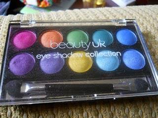
BeautyUK are a UK-based brand that have been big talk across beauty blogs over the past few months. With regards to their brand message of:
"A beautyuk woman makes her own statement."I can't help but compare them to another UK-based cosmetics brand, which is Barry M. I really hate comparing new companies to already established ones, because whilst comparisons are often considered to be a huge compliment, I always feel that doing it, is casting this huge shadow over them, before they've had a chance to come out on their own. And it also leads a little doubt in the brain, as to how "original" a new brand and/or product is, which again seems to be incredibly unfair.
Nevertheless, I think that BeautyUK could be a brand to watch, as they are very affordable and we should all be supporting small UK companies at times like these ;)
 Why did I chose the Soho Bright Pallette?
Price: The first thing to hit me about these palettes, was the price: £3.99 for ten shades is a very good deal, in my opinion, especially when you consider that brands like Urban Decay charge over £20 for six or seven shades, in a palette!
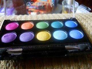
Packaging: The packaging of these palettes really is not a big selling point for me. They're quite uninspiring, unoriginal and look cheap. They actually remind me of the cheap eyeshadows that I used to buy in my early teens from the local market. Ultimately, they feel a bit dated.
Nevertheless, does the packaging really matter when it comes to a budget line of make up? Are you paying for the packaging, or the quality of the product? And we all know that if you want to save money on any cosmetic, you can not expect both the packaging and the product to be top notch, because something has to give, otherwise the company wouldn't make a profit. And I know, we hate the idea of a company making any kind of profit, but if they didn't make one, you wouldn't get your beauty products. Fact.
 Colours: There are six palette's overall, but I chose the Soho Bright collection, purely because I don't own either a yellow or an orange shadow and I was really keen to give them a try.
But, the colours in the other palettes were a little too neutral for my tastes.
The only colour that I was skeptical about was the pink in the top left corner, which I thought would be a bit too bold my my complexion.
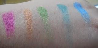
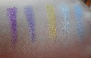
Swatches: I've never done swatches on my blog before, of eyeshadows, but I've noticed from reading other blogs, that people seem to really like them, so I decided to do a couple for you:

Top Row of Colours
The top row seems to be the bright colours. And I should note here, that I didn't swatch any of the colours using any kind of primer, so the colours that you are seeing are straight onto the skin. This of course means that they could (and probably will) look brighter with a good primer, but I wanted to showing them "as they are".
Bottom Row of Colours
All of the colours (yes, including the pink) are gorgeous, and I think that they work really great together. So far, in my experimenting with this palette, I have used two colour combinations:1. The yellow (bottom row, middle) over the eye lid, and the orange (top row, second from the left) just below the brow bone. When I started doing this look, I imagined that I was going to end up looking ridiculous, but I actually liked how subtle the two colours are, especially beside each other, and luckily they didn't need too much blending to work.
2. The bright purple (bottom row, first on the left) and the bright pink (top row, first on the left) and this is another that I really expected to look stupid, because I can't normally wear a bright pink. However, the pink was a lot more subtle than another bright pink that I own, and paired with the purple, it worked really well. Unlike the yellow and orange, however, it did need to be quite blended to work well.
From these two experiences, I seem to have come to the conclusion that this palette works well, if I use the bottom row over the entire lid, and then use a colour from the top row beneath the brow bone. So far, this method has worked extremely well, but only time will tell if that will remain the case.
Long Lasting...? One tip I will offer to anyone considering buying this palette, is to make sure that you wear them with an eyeshadow primer. I know that this is pretty much an unwritten given for most people, but to emphasise how much it is needed with these colours, when I was swatching them, I was actually taking photos of a wide range of products, and ten minutes (if that), after doing these swatches, I looked down at my hand, and they'd all gone. I hadn't washed my hands, and I hadn't rubbed them, so I am guessing that without a good primer, these shadows are not going to be sticking around on your eyelids for very long.
Overall: For a cheap little palette, this one ticks all the fundamental boxes. It doesn't matter that the packaging looks cheap, because that's not what you're paying for. If you want nice packaging, you'll have to spend more cash for it.
The colours are absolutely fab, and I really loved them. Just remember to use a priming base on your lids before applying them.


