TAKEAWAY: Info graphics aritst and expert, Jeff Goertzen, of the Denver Post, carries through a workshop exercise he conducted recently with members of the graphics team of Zamam, the Turkish daily, in Istanbul.
A graphics workshop: with Jeff Goertzen
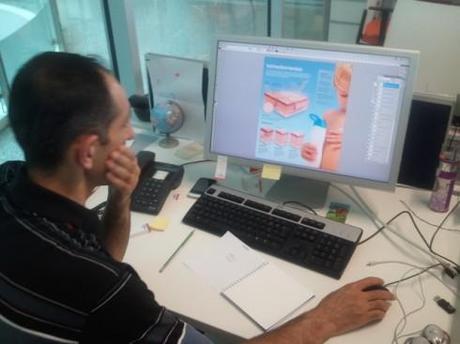
Two weeks ago, Jeff Goertzen and I shared the program for the annual +1T Design Days seminar in Istanbul. Part of Jeff’s work during this seminar was to conduct a one day workshop with the graphics team of Zaman. He shares with us today how he conducted the workshop, the concept behind the graphics, and the final results.
In his own words:
Istanbul, an exotic geographic culture where Europe meets Asia. The only metropolis in the world that is situated on two continents. The 13 million people who live here are mostly Muslim, with over 2,000 active mosques in the city to attest to that. And when it comes to newspapers, the choices are almost as bountiful as its mosques, roughly 18 from which to chose. Our setting is Zaman, Turkey’s largest circulating newspaper of over 1 million. A perfect setting for a graphics workshop!
1. BRAINSTORM: Our project began with Zaman’s artists coming up with an idea for a graphic to publish in their newspaper. Being that it was summer, we decided that the topic would be the dangers of the sun’s UV rays. We made a list of topics that we could use to explain in the graphic.
The list: (Image: Topics list)
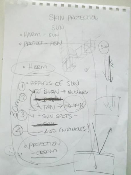
a. UVA and UVB rays— what they are and how they penetrate the skin
b. Melanin and how the body uses it to protect the skin
c. Sun burn
d. Sun spots
e. Aging
f. Preventative steps you can take to protect yourself from the sun
g. A heat map of Turkey showing where the sun is strongest
2. RESEARCH
Each artist was assigned a topic from the list and were given 30 minutes to research their topic on the internet When we regrouped, each artist gave a summary of their findings. (Image: research notes)
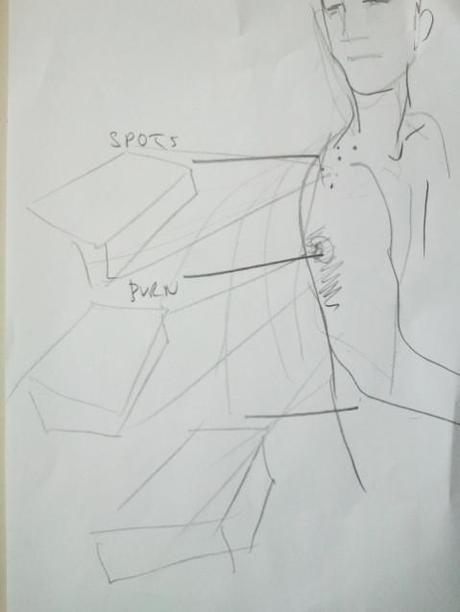
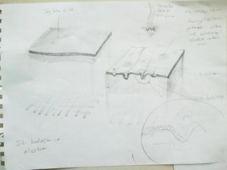
3. SKETCH: With all of our information at hand, we sketched out our ideas. For the most part, sketching was a process that Zaman artists were not accustomed to doing. Most of their assignments come to them at the last minute, leaving them little or no time to think things out. In this exercise, each artist sketched out their own version of how they would design the graphic based on the information. (Images: Sketch; Sketch2; Sketch3; Sketch4)
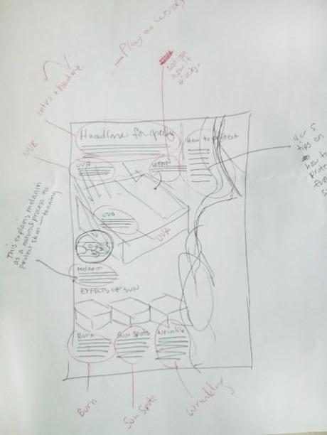
Because this would be a stand-alone graphic, we decided that we needed a dominant image that said “fun in the sun.“ We discussed the possibilities of using an illustration, but agreed that a photo of a person would connect better with the readers. I suggested that we use a woman in a bikini for visual impact, but because of the conservative Muslim culture, Zaman would not run such a photo. So we decided the image of a child would be more appropriate.
The first version of the graphic was a good start, but it needed a lot of work. First, of all the artists decided to use one large diagram of the skin to illustrate all the items on the list. I found this too confusing and hard to follow. The reader doesn’t really know where to begin and end. Also, the image of the child was to overpowering. The facial expression and the strong colors kept pulling my eyes away from the graphic. And using a palm tree and beach in the background to create an environment was over designing the graphic. (Image: First version graphic)
4. DESIGN: We went to fotolia.com where you can purchase studio-quality photos at a very reasonable price and found this great image of a child applying sun screen. This would be our dominant image. (Image: Child photo)

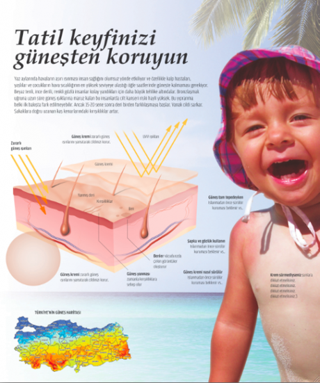
First sketch
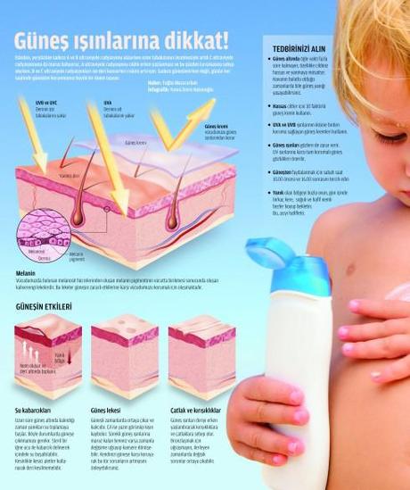
Final version
We stayed with a simple blue sky background and cropped the photo, showing just enough of the child so readers get the idea. This put more emphasis on the graphic information. (Image: final version graphic)
For the graphic images, we illustrated the affects of the sun with four diagrams. The first one served as an introduction that explained the two types of UV rays and how the skin releases melanin as a means of protection. We made it larger, so readers would have a point of entry. The smaller skin cubes below explain the three types of damage to the skin from extreme exposure to the sun. For the rendering style, I asked the artists to use Photoshop and incorporate some rich textures to add realism to the diagrams. I’ve always preferred realism over simple vector diagrams because there’s a visual richness that gives the reader more information and visual pleasure.
Our next graphics project … Hooka pipes!

