The tools of design are dangerous in the wrong hands.
Everyone’s doing it. Yeah, you know what I’m talking about: DIY design.
I’m not gonna lie to you: It will be cheaper to design your own business cards and marketing brochures. But before you invest in the newest edition of Microsoft Publisher, hang on! Your friendly neighborhood graphic designer (that’d be me) must advise you against designing something when you’re obviously not ready for the consequences. Good graphic design requires the proper tools and knowledge of how to use them.
“But everyone else is already doing it!” you say.
Whether that’s true or not, I know you’re going to do it anyway at some point. So I feel that it’s my duty to educate you on what might happen if you’re not careful. Protect yourself now, or you could be dealing with unintended consequences down the road…

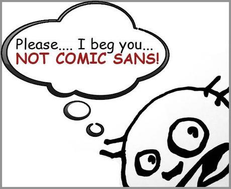
Even comic-strip characters hate Comic Sans.
DIY Design Sin #1: Using Comic Sans.
This font is everywhere: you’ve seen it on childcare advertisements, office memos, and flyers for lost pets. Since it’s so popular, that must mean it’s a good choice, right?
You couldn’t be more wrong. You could try, but you would not be successful.
Comic Sans is the bane of existence of the graphic and web design world. Every time someone prints something using Comic Sans, a designer somewhere dies a little inside. You think it’s carefree and fun; we think it’s evil. You think it’s popular and well-liked; we think it’s evil. You think it enhances your message; we just think it’s evil.
Where did this intense hatred start? Honestly, I don’t know. All I know is that a) Microsoft “designed” it, and 2) it is so overused it makes me want to cry. That’s enough for me. (Comic Sans Criminal gives a more entertaining history if you’re interested.)
The bottom line is, if you want to look professional, it doesn’t matter how you personally feel about Comic Sans. Don’t use it. It will pretty much ruin any credibility you have. The only exception is if the average age of your audience is 7 or you are actually designing a comic—in which case there are myriad less-ubiquitous options.
Other fonts to avoid:
- Papyrus (overused and cliche)
- Arial (Microsoft’s knockoff of classic Helvetica)
- Times New Roman (not changing the default font makes you look lazy)
- Anything ridiculously cutesy or hard to read (like this font, for more reasons than one)

When it comes to real estate, who doesn't like a big yard? Apply the same thinking to your DIY marketing. (Photo: stock.xchng)
DIY Design Sin #2. Filling up every square centimeter of available real estate.
For many new and non-designers, white space is scary. If it’s empty, they think, we must fill it. Their gut instinct is to fill up the entire page with every possible thing a customer might want to know. Because then you ensure the reader gets all the information, right?
Au contraire. This technique results in some very cluttered, overwhelming pages that have no visible hierarchy, no focus and no readers. Because who is going to read a brochure that is an assault on your visual senses?
White space—also known as negative space (a term that doesn’t help with its reputation)—is an essential part of design. Proper use of white space helps balance the design and subtly direct your reader’s eyes where you want them to go, as well as provide a “break” so as not to overwhelm. While it seems simple, this is a tricky technique to master, so for now, just avoid filling up the entire page and you should be good.
Learn more:
Check out Before & After Magazine‘s quick video demonstrating The Power of Empty Space.

If you can see the pixels in your image, nix it. (Photo: stock.xchng)
DIY Design Sin #3. Using bad graphics.
Images are a great way to enhance your message and attract attention… But make sure the graphics you choose have a positive impact. If you’re using an image that doesn’t work, just to fill space, you’re doing more harm than good.
This design rule is pretty easy to master: Simply don’t use bad images. What constitutes a bad image? I’m so glad you asked!
If your image meets any of the following characteristics, delete it immediately:
- It has nothing to do with your business or topic being discussed
- It has been distorted so that the proportions are off
- It has been enlarged past 100% so it has become pixelated
- It is poor quality or low resolution
- It is stolen
- It is clipart
- Its style is inappropriate for your brand (e.g., using a cartoon when you are a bank)

While it's good to change your underwear often, changing your company's colors on a similar time-table is a no-no. (Photo courtesy Flickr user eriwst under creative commons license.)
DIY Design Sin #4. Changing your colors as often as you change your underwear.
Like anything else, color can often be dependent on trends (think the mustard yellow and pea green hues of the ’70s), and people’s tastes can change fairly often. One of my favorite exercises in design is coming up with new color schemes. Sadly, I cannot always use these color schemes. Why? Because color is an essential part of your brand and its image, and it’s something you shouldn’t deviate from on (insert current project here) just because a certain color has become popular.
Once you have a color palette (consisting of a couple of main colors and a few accents), the best thing to do is stick with it. Presumably you’ve put a lot of thought into this, and maybe even tested the colors on your team and existing clients, so don’t undo all that work on a whim. This could result in a lot of confusion on your clients’ part. Not only that, but constantly changing your colors could be construed as instability and disorganization.
And please, above all, do not alternate colors of individual letters within words without a damn good reason. This is visually confusing. People tend to group similar things together, so by changing the color of every letter, you’re inadvertently denoting that these items do not belong together, which can negatively affect readability. Not to mention it looks insanely childish.
Other things you shouldn’t change like underwear:
- Your brand’s logo (duh)
- The typefaces your brand uses in marketing materials
- Changes to both of these require an entirely new branding strategy that should be carefully considered before implementing.
To be continued…
Next time, we’ll cover Deadly DIY Design Sins 4 through 7. In the meantime, what do you think about these tips? Think they’re doable? Will they help with your future DIY graphics projects? What do you think is missing from this list?

