Graph No. 1
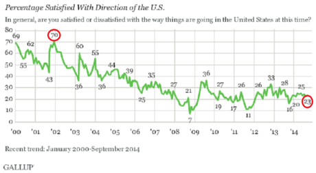
Percentage of Americans satisfied with the direction the U.S. is going.
Gallup Poll of Sept. 12, 2014 found that only 23% of Americans are satisfied with the direction of the U.S.; 76% are not. Compare that to the high of 70% satisfied in 2002.
Click graph to enlarge

Graph No. 2
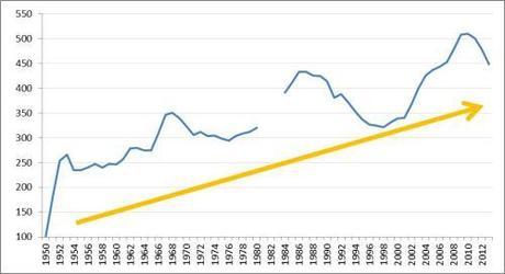
Index of NATO’s military expenditures since 1950 (where 1950 expenditures = 100; calculated in 2011 constant US$). This is the longest data series on military expenditures that’s publicly available. (Source: SIPRI via ZeroHedge)

Graph No. 3
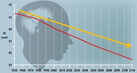
World IQ level over time (Source: University of Hartford)
I.Q. is the intelligence quotient used to measure the intelligence of every human on the planet. Most people in modern day society have an average I.Q. ranging between 89 and 100.
The larger the human population grows, the average human I.Q. seems to drop. Studies conducted in recent years have shown a direct correlation between population growth and the decline in the standard I. Q of countries such as New Zeland, Australia, Brazil and Mexico. The average world I.Q. for 2011 is calculated to be 88.54 — the lowest I.Q. rate in years. At that rate, for every 10 years a .30 I.Q drop occurs, so it is predicted that by the year 2050, the average I. Q. will have fallen to 89.32 from 91.64 in 1950.

See also:
- Americans are getting dumber – in one graph
- New kicking game is proof American youth are getting dumb and dumber
~Eowyn

