Check out the other blogs in this 2012 trend mini-series!
- Part 1 of 3 - 2012 Trend Watch: Soft Themes
- Part 2 of 3 - 2012 Trend Watch: Colors
- Part 3 of 3 - 2012 Trend Watch: Fonts
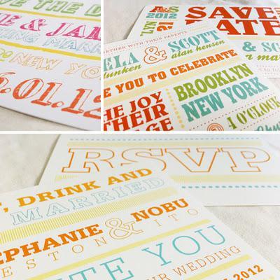
Fonts and font design in 2012 will be pushed more than ever before... Pay close attention to usage, scale and combinations. I've been seeing over-sized ampersands, circus fonts, cool seamless patterns and contemporary font-styled combinations. The possibilities here have become endless.
Some of these touches are pleasant surprises that add the "wow factor" and interest to invitation suites. Others might be a little much. Invitation designers must, as one of my favorite style authorities Tim Gunn would say, bring an "editing eye" to their work.
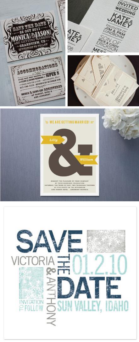
Photo credits clockwise from l to r:emdotzee.com | davidairey.com | en.paperblog.com | stationerywithane.comminted.com/blog
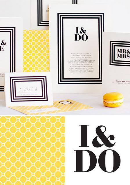
http://www.mitchellanddent.com.au/
http://creativestartdesign.com/
