 3/5 Stars
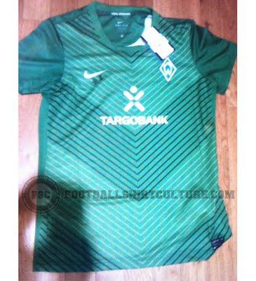
Werder Bremen has certainly had some interesting designs over the years, and this one is definitely an improvement on
last year's look. The poor quality image doesn't help with the first impression, but it's definitely continuing to grow on me even as I continue to write. I'm a big fan of pinstripes, and the alternating colors in the V-shaped pattern give the shirt a nice effect. The Werder Bremen logo has always been a favorite of mine, and it pairs nicely with this design. The sponsor logo is also not entirely off-putting. I may have to jump the rating up to a solid four.Away: 2/5 Stars
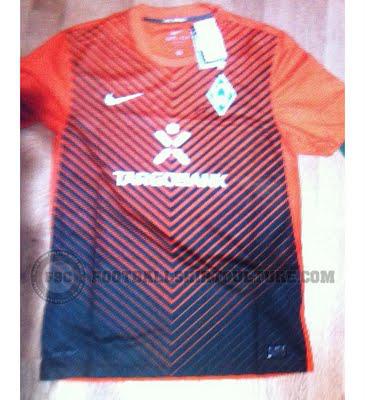
There is obvious symmetry between the 2011/12 home and away kits for Werder. I'm not thrilled about the color scheme on this shirt, just as I wasn't about jack-o-lanterns Chelsea sported last EPL campaign, but I will admit I'm in love with the color-fade idea. I'm expecting (hoping) it's a little more appealing when a better image of the shirt is released, and I'm not completely sold on the overall look as of yet, but it definitely has potential.
